Design history · 1920s–1960s

A.M. Cassandre

The French designer who turned the poster into a modern graphic object — and the typographer behind Bifur, Peignot and the YSL monogram.

A.M. Cassandre (1901–1968) is the French graphic designer whose posters for trains, ocean liners and Dubonnet aperitifs defined the Art Deco poster as a modern visual form. He co-founded the Alliance Graphique agency in 1926, designed Bifur, Acier Noir and Peignot at Deberny & Peignot, and in 1963 produced the cursive YSL monogram still in use by Yves Saint Laurent today.

Key facts

Born
24 January 1901, Kharkiv, Ukraine (then Russian Empire)
Died
19 June 1968, Paris, France (aged 67)
Legal name
Adolphe-Jean-Marie Mouron
Nationality
French
Era
Art Deco · Modernist poster · Experimental typography
Studios
Alliance Graphique, Paris (co-founder, 1926) · Deberny & Peignot (type designer)
Known for
Étoile du Nord (1927) · Dubo Dubon Dubonnet (1932) · Normandie (1935) · Bifur (1929) · Peignot (1937) · YSL logo (1963)

Biography

Adolphe-Jean-Marie Mouron was born in Kharkiv in 1901, the son of a French wine merchant based in the Russian Empire. The family returned to Paris at the outbreak of the First World War. He trained at the École des Beaux-Arts and the Académie Julian, and by 1923 he was working commercially under the pseudonym Cassandre — a name he would use for the rest of his career.

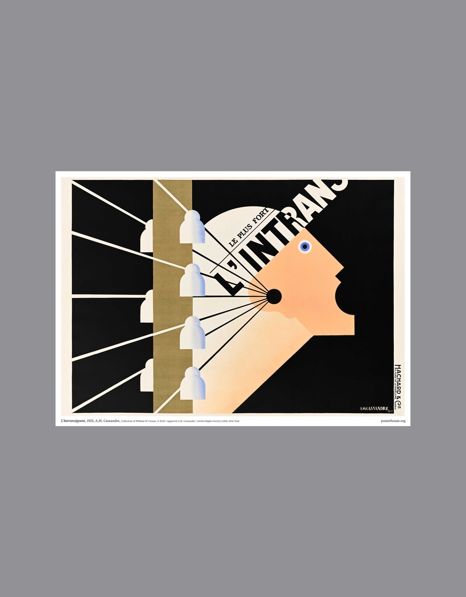
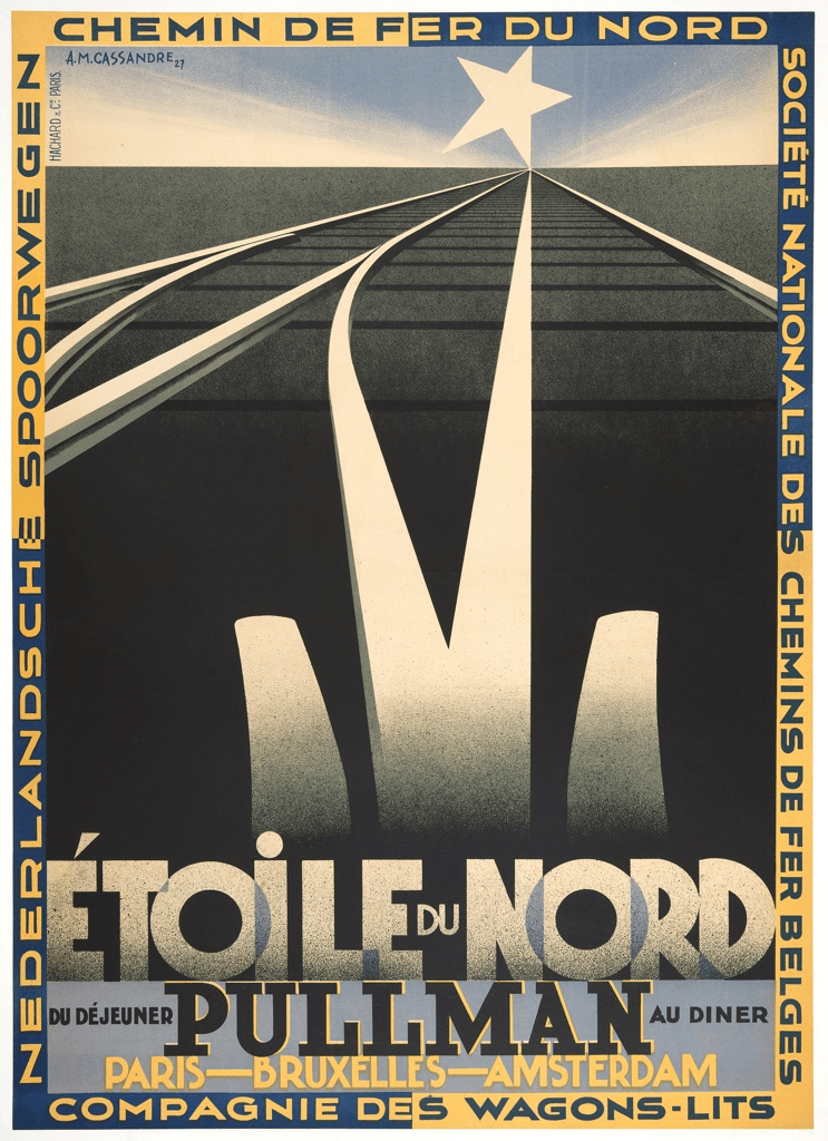
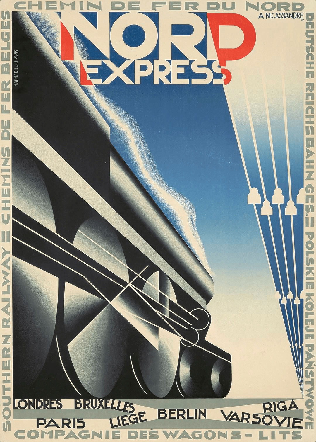
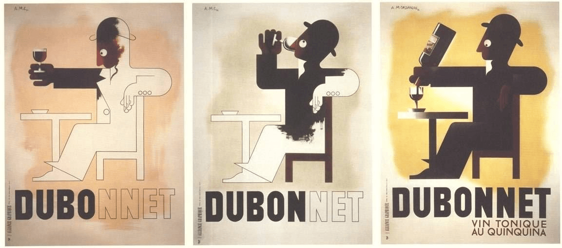
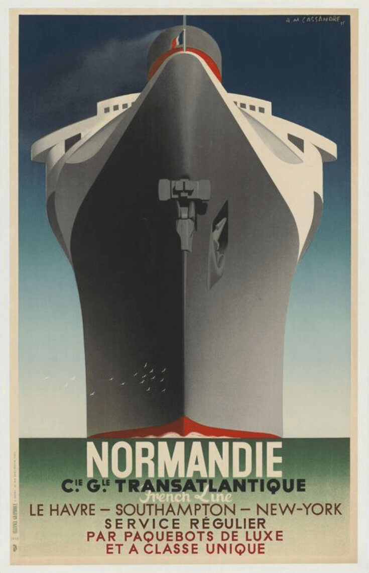
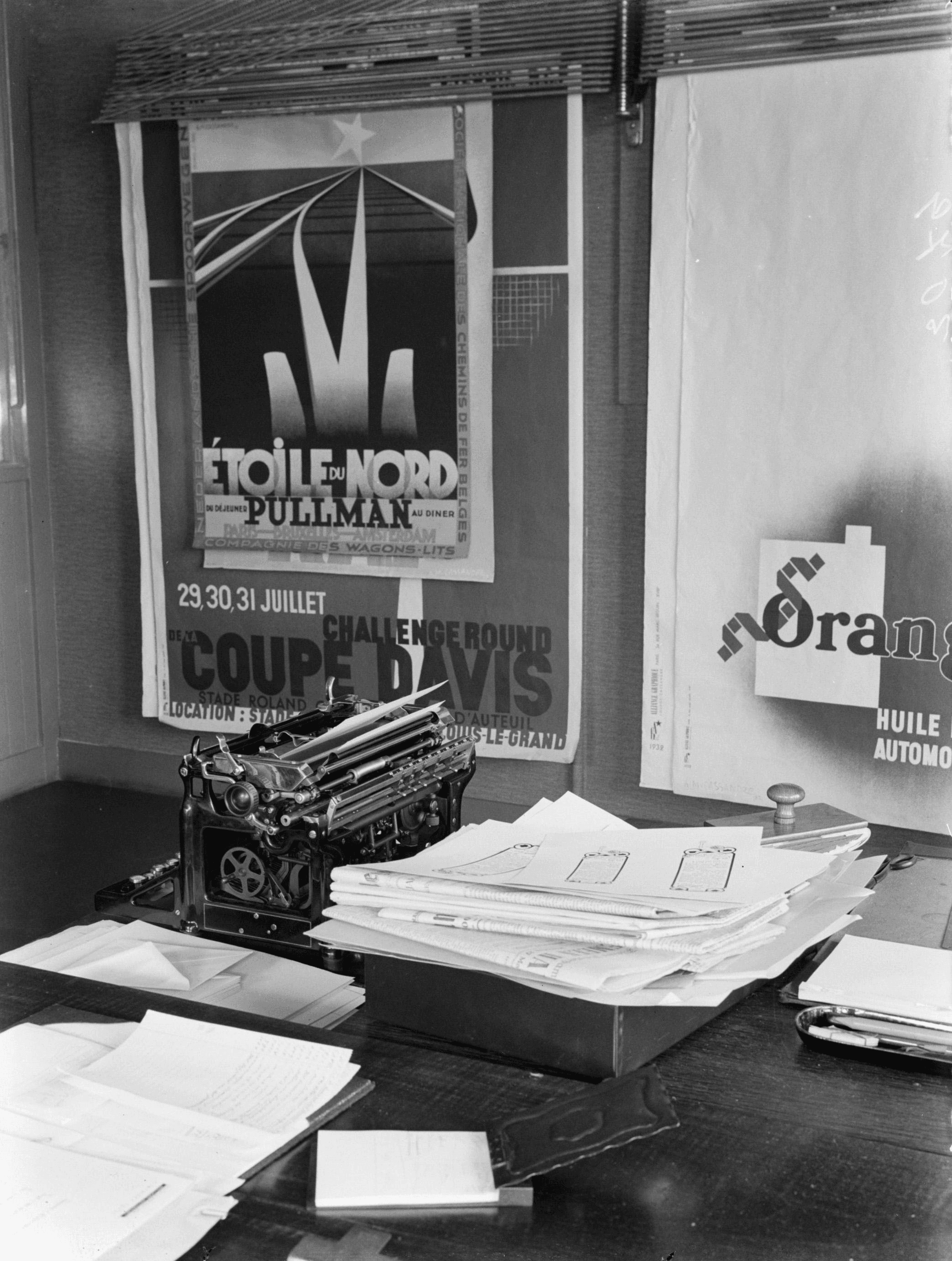
His first major commercial poster, Au Bûcheron (1923), brought immediate attention. Over the next decade he produced a sustained run of travel, product and event posters that defined the visual language of French Art Deco commercial design — Étoile du Nord (1927), Nord Express (1927), L.M.S. Bestway (1928), the Dubonnet serial campaign (1932), Normandie (1935).

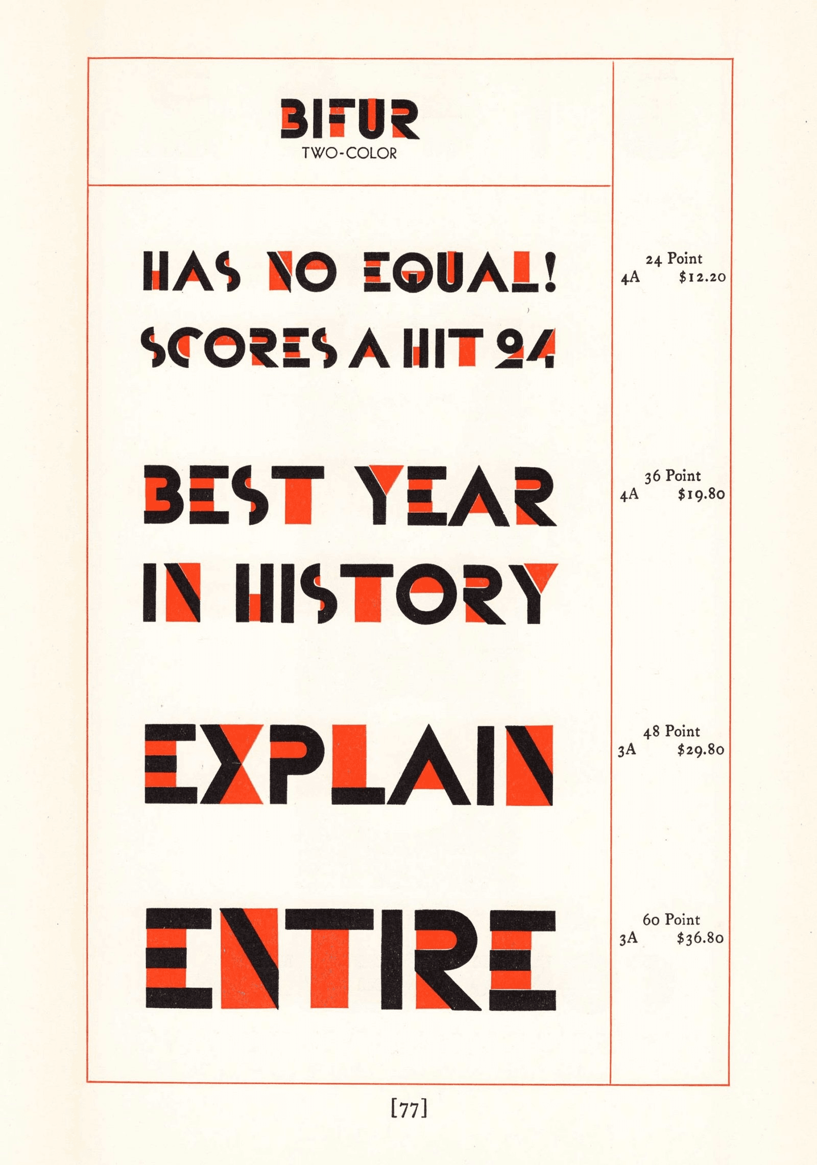
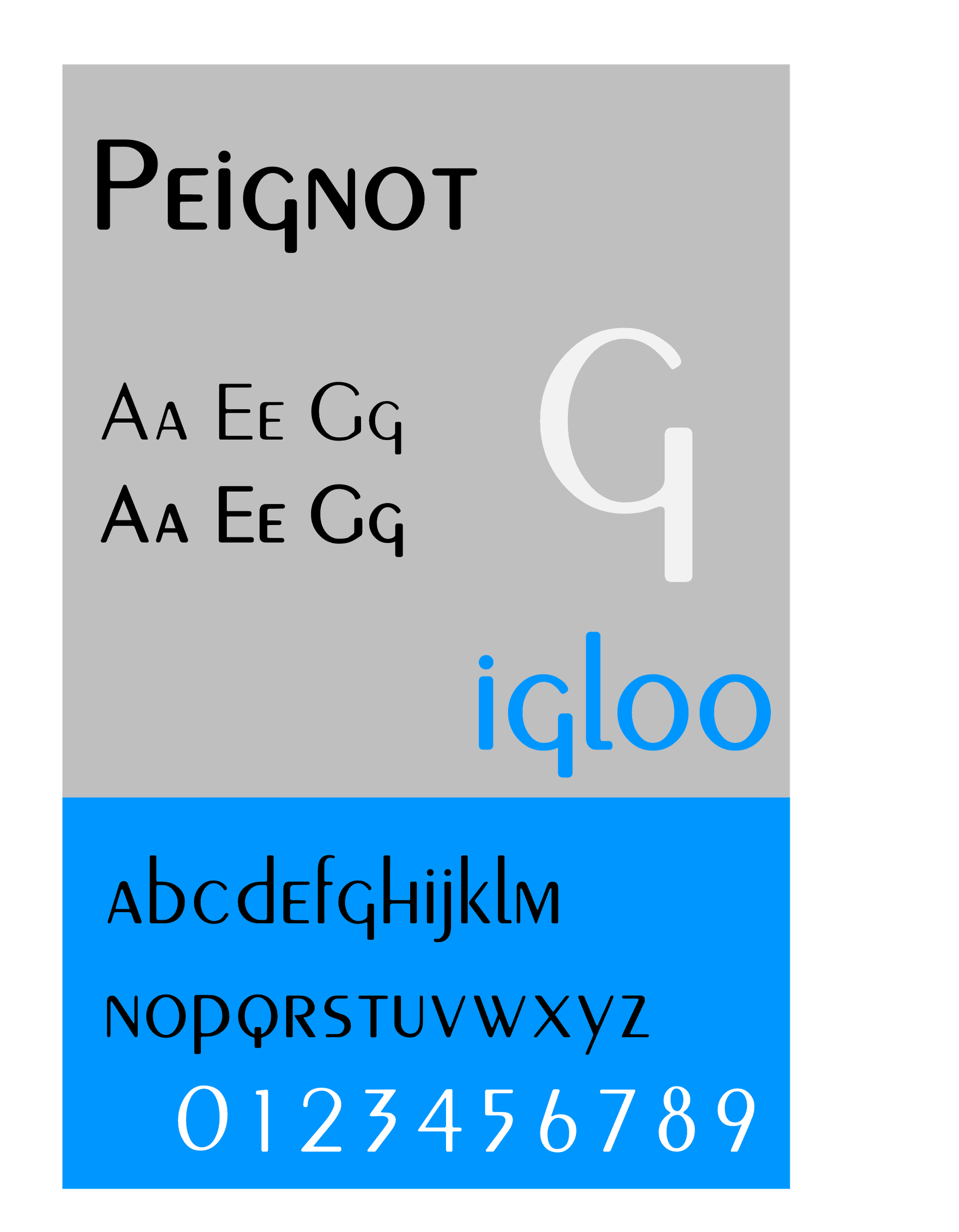
In 1926 he co-founded Alliance Graphique with Maurice Moyrand — one of the first modern advertising agencies in France. Through Alliance Graphique he also began designing typefaces for Deberny & Peignot: Bifur (1929), Acier Noir (1935) and Peignot (1937). The 1937 Paris Exposition Internationale awarded him a Grand Prix.

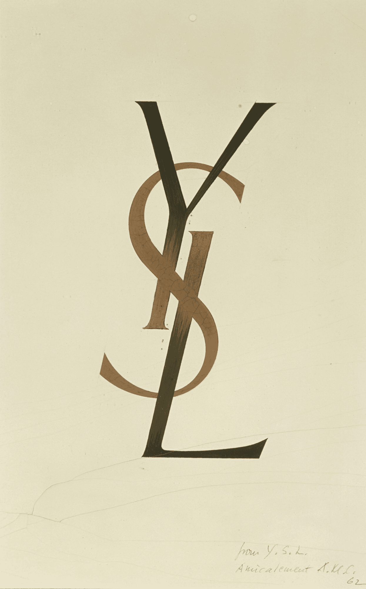
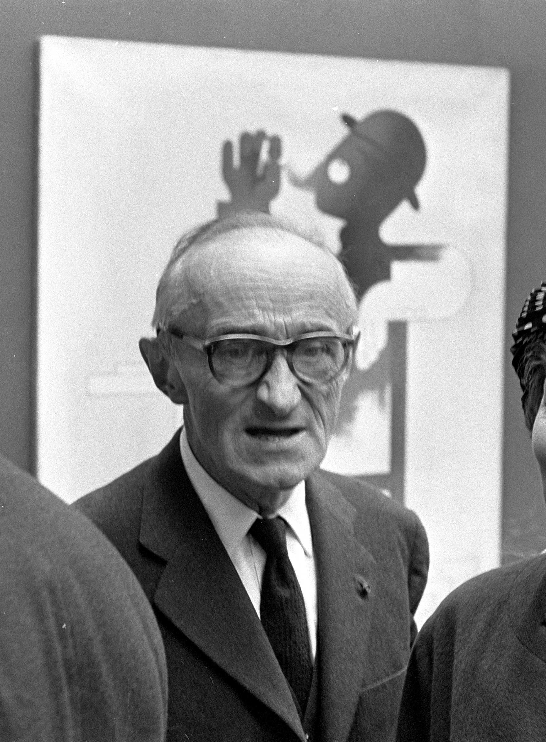
In 1939, at the peak of his poster-design reputation, he largely abandoned commercial work for stage design (Comédie-Française, Opéra de Paris, Metropolitan Opera) and painting. He returned intermittently to commercial projects, most famously producing the cursive YSL monogram for Yves Saint Laurent in 1963 — a logo still in use more than six decades later. He died in Paris in 1968, aged sixty-seven.

Design philosophy

Cassandre’s premise was that the modern poster must be designed for the conditions in which it will be seen — not as a scaled-up painting, but as a graphic object that works from a moving vehicle, at a distance, in passing.

“The poster is only a means to an end. Painting is an end in itself. The poster demands only that the artist shall be a transmitter, a telegraph operator who does not originate news but merely dispatches it. Whether he likes it or not he is merely an intermediary.” — A.M. Cassandre

From that premise he derived a characteristic method. The Dubonnet campaign (1932) was engineered as three successive panels that a car passenger would read in sequence — one of the first examples of poster design explicitly conceived for modern transport speeds. Étoile du Nord compresses depth into a single geometric plane so that the image resolves at a glance. Normandie reduces an ocean liner to a frontal geometric volume that reads instantly as monumental.

His second premise was that typography is a graphic element, not only an information carrier. Bifur, Acier Noir and Peignot all treat the letter as a shape first, a phonetic signal second — a position later associated with display-type practice but startling in the context of 1929 continental typography.

Key works

Étoile du Nord (1927) — poster for the Chemins de fer du Nord’s Paris–Amsterdam express. Converging rails, a geometric star, Cubist spatial compression. The single most reproduced object in his catalogue.

Nord Express (1927) — companion poster for the international sleeper service. A locomotive rendered as pure geometric volume.

Dubo Dubon Dubonnet (1932) — three-panel serial campaign for Dubonnet aperitifs. A seated figure in silhouette progressively fills in through the three panels as the word Dubonnet is assembled. Engineered for a passenger reading in sequence from a moving car.

Normandie (1935) — SS Normandie transatlantic liner poster. The prow of the ship foreshortened into a near-symmetrical vertical composition. A defining Art Deco image.

YSL monogram (1963) — cursive interlocking Y-S-L for the Yves Saint Laurent couture house. Still in continuous use.

Bifur (1929), Acier Noir (1935), Peignot (1937) — three display typefaces released by Deberny & Peignot. Bifur in particular treats the letter as an abstract shape fragment supplemented by tonal fill — one of the earliest typefaces marketed explicitly as a graphic object.

Iconic works

Étoile du Nord, 1927

Étoile du Nord

1927

Poster for the Chemins de fer du Nord's Paris–Amsterdam luxury express. Converging rails, geometric star, Cubist-derived spatial compression. Commissioned by the Chemins de fer du Nord railway company; original lithographs are held by the Museum of Modern Art, New York, and the Musée de la Publicité at the Musée des Arts Décoratifs, Paris.
Étoile du Nord (1927). · Cooper Hewitt Smithsonian Design Museum (authoritative source); Smithsonian Open Access program allows use with attribution; dimensions not provided in metadata. · Museum editorial
Nord Express, 1927

Nord Express

1927

Companion poster for the Nord Express international train service, the overnight express connecting Paris to Berlin, Warsaw, and Riga via the Compagnie Internationale des Wagons-Lits. The locomotive is rendered as pure geometric volume. Copies are held by the Victoria and Albert Museum, London, and the Bibliothèque Forney, Paris.
Nord Express (1927). · Giovanni Patrone Amérique duNord Express 1934 · Museum editorial
Dubo Dubon Dubonnet, 1932

Dubo Dubon Dubonnet

1932

Three-panel serial poster for Dubonnet aperitifs, designed specifically to be read in sequence by a passenger in a moving vehicle. Commissioned by the Dubonnet company for outdoor hoardings along Parisian metro and road routes. Each panel shows a seated figure progressively filling in as the word "Dubonnet" is assembled, letter by letter.
Dubo Dubon Dubonnet (1932). · Three-panel series view from People's Graphic Design Archive, sourced from MoMA collection. Shows complete narrative sequence. · Museum editorial
Normandie, 1935

Normandie

1935

Poster for the SS Normandie transatlantic liner. A near-symmetrical frontal view of the ship's prow, foreshortened into a monumental vertical composition. Commissioned by the Compagnie Générale Transatlantique (the French Line) for the vessel's maiden Atlantic crossing in May 1935; original lithographs are held by the Library of Congress, Washington D.C., and the Musée de la Marine, Paris.
Normandie (1935). · V&A Museum IIIF image; original lithograph 62.5 × 100.5 cm; in Study Room viewable by appointment. · Museum editorial
YSL monogram, 1963

YSL monogram

1963

Cursive interlocking Y-S-L logotype commissioned by Yves Saint Laurent at the launch of the couture house, which Saint Laurent had founded in Paris in 1962. The brief called for a hand-drawn monogram to serve as the house's primary commercial mark. The logo remains in continuous use by the brand, now owned by Kering.
YSL monogram (1963). · Official Musée Yves Saint Laurent Paris collection — highest authority; the hand-drawn monogram as preserved in the museum. · Museum editorial
Bifur (typeface), 1929

Bifur (typeface)

1929

Display typeface released by the Deberny & Peignot foundry, Paris. Each letter is treated as a geometric fragment supplemented by a tonal fill, readable as a visual signal rather than a phonetic letterform. Published in 1929 in a single uppercase weight; digital revivals have been produced by Linotype and independent type distributors.
Bifur (typeface) (1929). · Continental Types specimen book scan (1930) showing Bifur's two-color chromatic version—the defining feature of the design. · Museum editorial
Acier Noir (typeface), 1935

Acier Noir (typeface)

1935

Two-weight display family released by the Deberny & Peignot foundry, Paris, in 1935. The design draws on blackletter structural forms while replacing their calligraphic variation with consistent mechanical weight. The family comprised two cuts: a lighter Acier and the heavier Acier Noir.
Acier Noir (typeface) (1935). · Willem van de Poll · Public domain
Peignot (typeface), 1937

Peignot (typeface)

1937

Humanist-inflected sans-serif display face released by the Deberny & Peignot foundry for the Exposition Internationale des Arts et Techniques dans la Vie Moderne, Paris, 1937. Named after Charles Peignot, proprietor of the foundry. The unusual mixed-case forms, in which the lowercase characters take capital-like shapes, made it a dominant face in French display typography through the mid-twentieth century.
Peignot (typeface) (1937). · J4lambert · CC BY-SA

Influence & legacy

Cassandre’s influence runs through two channels: the posters and the typefaces. The posters established the aesthetic vocabulary that twentieth-century travel and product advertising would draw from for decades — clean geometric composition, Cubist-derived spatial compression, typography integrated with image as a single graphic statement. Every subsequent generation of European poster designers worked in his shadow; the Swiss-school poster generation (Müller- Brockmann, Hofmann) effectively abstracted and formalised what he had already shown could be done.

His type-design work — Bifur especially — set a precedent for treating the display typeface as a graphic object. Every mid- and late-twentieth-century experimental display face, from Herbert Bayer’s Universal through the 1980s postmodern work of Neville Brody and Emigre, is recognisably downstream.

The YSL monogram (1963) is itself one of the longest continuously used commercial marks still drawn by hand. The MoMA, the Musée des Arts Décoratifs, and the Bibliothèque Forney in Paris hold major poster collections.

Learn at TGDS

Cassandre’s integration of typography and image is foundational to how we teach poster and editorial work. If his approach interests you, the most direct next steps are:

Courses

Further reading

Books

  • Henri Mouron, A.M. Cassandre: Posters, Typography, Stage Design, Graphic Art (Rizzoli, 1985) — the primary English-language monograph, written by Cassandre’s son.
  • Anne Ghesquière (ed.), Cassandre: Classic Posters (Pepin Press, 2007).
  • Steven Heller & Louise Fili, French Modern: Art Deco Graphic Design (Chronicle Books, 1997).
  • Alain Weill, The Poster: A Worldwide Survey and History (G.K. Hall, 1985) — Cassandre chapter.

Get Started.

You can enrol any day of the year. We are online and study is self-paced, there is no pressure. Enrol when you are ready to start, from anywhere in the world. If you would like to chat or email, feel free to get in touch.

Brochures, Phone Calls & Questions

You can download a free brochure, book a phone call with one of our course advisors, or simply ask a question.

Other ways to get in touch

Australia 1300 655 485

International +61 1300 655 485

Ask Anything info@thegraphicdesignschool.com

Get a quote accounts@thegraphicdesignschool.com

Acknowledgement of Country
The Graphic Design School acknowledges the Traditional Custodians of Country throughout Australia and their continued spiritual connection to land.
We pay respect to Elders past, present and emerging.
Always was, always will be.
RTO Provider № 91706