Design history · 1990s postmodernism

David Carson

The surfer-turned-art-director who tore up the Swiss rulebook and made type feel again.

David Carson (born 1955) is the American art director who defined 1990s grunge and deconstruction typography. As founding art director of Ray Gun magazine (1992–1996) he broke nearly every Swiss-school convention in public — and his 1995 book The End of Print became the best-selling graphic design book ever published.

Key facts

Born
8 September 1955, Corpus Christi, Texas, USA
Nationality
American
Era
Postmodernism · Grunge typography · Deconstruction
Studios
Transworld Skateboarding (art director, 1983–1987) · Beach Culture (1989–1991) · Ray Gun (founding art director, 1992–1996) · David Carson Design, New York (1995–present)
Known for
Ray Gun magazine · The End of Print (1995) · grunge/deconstruction typography · Nike, Pepsi and MTV campaign work
Background
Former top-ten professional surfer · B.A. Sociology, San Diego State University (1977) · self-taught designer

Biography

David Carson was born in Corpus Christi, Texas in 1954 and spent his twenties as a professional surfer — ranked inside the world top ten in 1989. He took a B.A. in Sociology from San Diego State University in 1977, and had no formal design training. The craft was entirely self-taught, picked up through short workshops and editorial commissions.

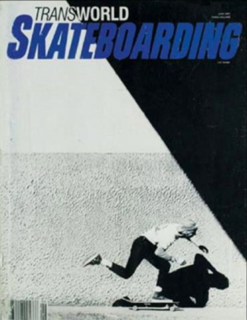
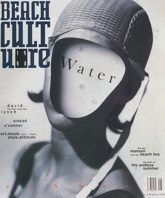
His first design job of consequence was art director of Transworld Skateboarding from 1983 to 1987 — four years of loose, expressive editorial layout that looked nothing like the mainstream magazine world of the time. He moved to the short-lived surf-culture quarterly Beach Culture from 1989 to 1991. Six issues, more than 150 awards, and a first wave of design-press attention outside California.

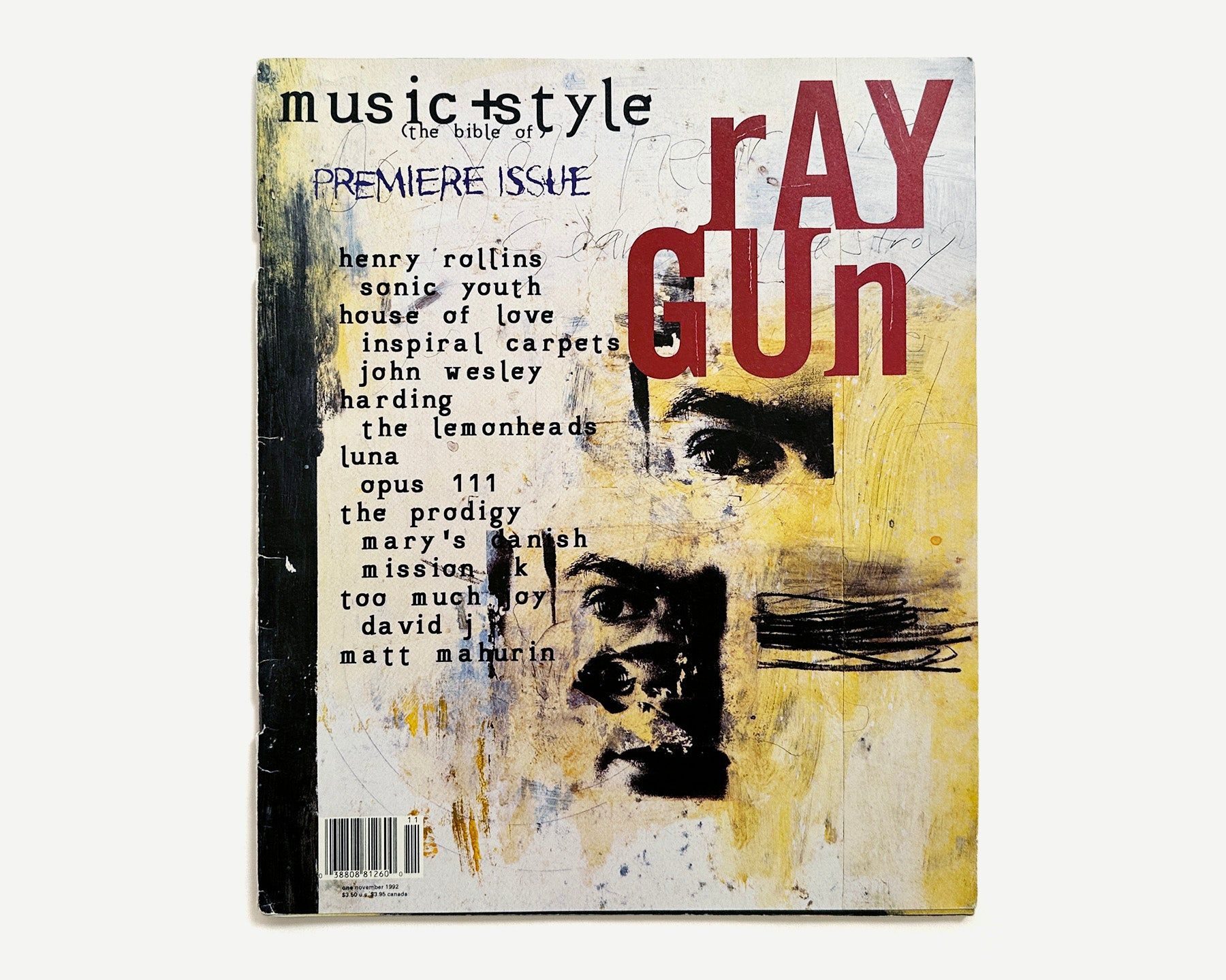
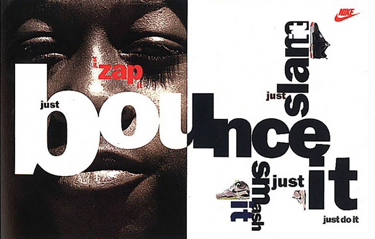
The defining role came in 1992, when he launched Ray Gun magazine in Los Angeles as founding art director. Thirty issues across four years turned him into one of the most imitated — and most argued-about — designers on the planet. Carson left Ray Gun in 1996 to open his own studio in New York, David Carson Design, and has worked commercially since for Nike, Pepsi, Microsoft, Armani, MTV, Levi’s, Sony, AT&T and Citibank. He remains professionally active.

Design philosophy

Carson’s position is the direct opposite of the Swiss school. Design, for him, is not a system for delivering information — it is an emotional and intuitive act that has to make the reader feel something before anything is read.

“Don’t mistake legibility for communication.” — David Carson

That single line is his most quoted — and his most attacked. Legibility, he argues, is a baseline, not the goal; a page that is technically readable but emotionally inert has not communicated anything. The Bryan Ferry interview he set entirely in Zapf Dingbats in Ray Gun (because he found the interview boring) is the canonical example: the design is the editorial judgement.

His method is deliberately un-systematic. He composes directly in the layout rather than working from a grid, breaks baselines, overlaps text, lets photographs bleed into type and treats the page as a single expressive surface. Rules are there to be tested against the content in front of him.

Key works

Transworld Skateboarding (1983–1987) — four years as art director of the leading US skateboard magazine. Carson’s first sustained editorial platform and the laboratory for everything that followed.

Beach Culture (1989–1991) — six issues of a short-lived surf-culture quarterly. A breakthrough award winner that brought Carson to the attention of the international design press.

Ray Gun magazine (1992–1996) — thirty issues of the Los Angeles alternative-music title. The defining document of 1990s grunge and deconstruction typography, and the most widely imitated editorial design of the decade.

The End of Print (1995) — monograph written with Lewis Blackwell. Reported to have sold more than 250,000 copies, widely cited as the best-selling graphic design book ever published.

Nike, Pepsi and MTV campaigns (mid-1990s onwards) — commercial print, advertising and television title work that carried the Ray Gun visual language into mainstream corporate advertising. The 1996 Nike “Hell Yes” / Hi poster is the most-reproduced single example.

Iconic works

Transworld Skateboarding art direction, 1983/1987

Transworld Skateboarding art direction

1983/1987

Four years as art director of the leading US skateboard title, published by Transworld Media in San Diego. Carson had no formal design training at the time; the role was his first sustained editorial platform, and the layouts he produced had no precedent in mainstream magazine publishing. The experience formed the working method he later applied at Beach Culture and Ray Gun.
Transworld Skateboarding art direction (1983/1987). · June 1987 magazine cover from Skateboard Magazine Archive — scanned archive of printed issue from Carson's tenure. · Museum editorial
Beach Culture magazine, 1989/1991

Beach Culture magazine

1989/1991

A surf-culture quarterly that ran to just six issues before closing in 1991. The run collected over 150 design awards and drew the first international design-press attention to Carson's work, establishing him as a figure outside California before Ray Gun launched. Carson served as art director throughout the magazine's entire publication run.
Beach Culture magazine (1989/1991). · Legendary third issue cover (August/September 1990) featuring Geof Kern photography; earned Carson 150+ design awards. · Museum editorial
Ray Gun magazine art direction, 1992/1996

Ray Gun magazine art direction

1992/1996

Founding art director of Ray Gun, an alternative-music magazine launched in Los Angeles in 1992. Across thirty issues, Carson dismantled Swiss-school editorial conventions, overprinting text, breaking baselines and treating the page as a single expressive surface. The Bryan Ferry interview, set entirely in Zapf Dingbats because Carson found the piece unengaging, became the canonical example of his editorial philosophy.
Ray Gun magazine art direction (1992/1996). · Early issue cover (1992) with Henry Rollins, Sonic Youth, Inspiral Carpets — early Carson layout examples from Dazed Digital archive · Museum editorial
The End of Print: The Graphic Design of David Carson, 1995

The End of Print: The Graphic Design of David Carson

1995

A monograph co-authored with writer Lewis Blackwell, published in 1995, collecting Carson's work from Transworld Skateboarding through his Ray Gun tenure. The book sold a reported 250,000 copies and is widely cited as the best-selling graphic design monograph ever published. It has been translated into multiple languages and released in revised editions.
The End of Print: The Graphic Design of David Carson (1995). · Primary cover from People's Graphic Design Archive (established crowdsourced archive). Shows Carson's trademark experimental typography with overlapping, multi-sized fonts in grayscale/monochrome. · Museum editorial
2ndsight: Grafik Design After the End of Print, 1997

2ndsight: Grafik Design After the End of Print

1997

A follow-up survey published by Laurence King in 1997, documenting Carson's commercial practice after leaving Ray Gun. The volume covers campaigns for Nike, Pepsi, MTV and Microsoft, showing the Ray Gun visual language operating in mainstream advertising contexts. The deliberately misspelled title reflects the anti-conventional tone of the work itself.
2ndsight: Grafik Design After the End of Print (1997). · Laurence King UK/international edition (1997, ISBN 9781856691048) — softcover release; may have different jacket design · Museum editorial
Trek, 2003

Trek

2003

A third monograph published by Gingko Press in 2003, covering roughly a decade of commercial, editorial and personal work from the post-Ray Gun period. The volume ranges across advertising, environmental graphics and photography, documenting projects for clients in North America, Europe and Japan. It is the most recent comprehensive survey of Carson's practice in book form.
Trek (2003). · Official source from David Carson's design portfolio; direct cover image embedded on book project page (~139KB JPEG indicates substantial resolution) · Museum editorial
Nike "Hell Yes" / Hi campaign, 1996

Nike "Hell Yes" / Hi campaign

1996

A poster and print campaign produced for Nike in 1996, commissioned shortly after Carson's departure from Ray Gun. The work brought his deconstructivist typographic approach into a high-profile advertising context, demonstrating that the visual language developed at an independent music magazine could operate at mass scale. The 'Hell Yes' poster is the most reproduced single piece from the campaign.
Nike "Hell Yes" / Hi campaign (1996). · Are.na-hosted Nike advertisement directly labeled as David Carson work; cover-fit processed version of original JPG. · AU statutory

Influence & legacy

Carson is the designer most often named when people talk about “postmodern graphic design” — even though he rejects the label. His Ray Gun layouts gave a whole generation of editorial, music and fashion designers permission to abandon the grid, and his commercial work from 1996 onwards carried that language into advertising for Nike, Pepsi, MTV and Microsoft.

The backlash has been equally loud. Modernist critics — most prominently Paul Rand and Massimo Vignelli — treated his work as the antithesis of serious design. That argument between systematic Swiss clarity and Carson’s intuitive expression is still the central axis along which students learn to locate themselves.

His 2003 TED talk, Design and discovery, has been viewed millions of times and remains one of the most circulated single lectures in design education. Thirty years on, The End of Print is still a first-year reading-list fixture.

Learn at TGDS

Carson is the counterweight to the Swiss-school material we teach elsewhere. If his work interests you, the most direct next steps are:

Courses

Further reading

Books

  • Lewis Blackwell and David Carson, The End of Print: The Graphic Design of David Carson (Laurence King, 1995).
  • David Carson and Lewis Blackwell, 2ndsight: Grafik Design After the End of Print (Laurence King, 1997).
  • David Carson, Trek (Gingko Press, 2003).
  • David Carson, David Carson: Photographs (Gingko Press, 2013).

Online

Get Started.

You can enrol any day of the year. We are online and study is self-paced, there is no pressure. Enrol when you are ready to start, from anywhere in the world. If you would like to chat or email, feel free to get in touch.

Brochures, Phone Calls & Questions

You can download a free brochure, book a phone call with one of our course advisors, or simply ask a question.

Other ways to get in touch

Australia 1300 655 485

International +61 1300 655 485

Ask Anything info@thegraphicdesignschool.com

Get a quote accounts@thegraphicdesignschool.com

Acknowledgement of Country
The Graphic Design School acknowledges the Traditional Custodians of Country throughout Australia and their continued spiritual connection to land.
We pay respect to Elders past, present and emerging.
Always was, always will be.
RTO Provider № 91706