Design history · 1920s

Herbert Bayer

The Bauhaus master who carried the movement to postwar America.

Herbert Bayer (1900–1985) is the Austrian Bauhaus master whose 1925 Universal Typeface proposed a rational, single-case alphabet for a technological society. He carried Bauhaus thinking into postwar American corporate design — at Container Corporation of America and the Aspen Institute — and is the definitive bridge figure between Weimar modernism and US commercial practice.

Key facts

Born
5 April 1900, Haag am Hausruck, Austria
Died
30 September 1985, Montecito, California
Nationality
Austrian (emigrated to US, 1938)
Era
Bauhaus · Modernism · American corporate modernism
Studios
Bauhaus Dessau (Typography + Advertising, 1925–1928) · Dorland agency Berlin (1928–1938) · Container Corporation of America (1946–1975) · Aspen Institute (1946–1985)
Known for
Universal Typeface (1925) · Bauhaus typography · Aspen Institute design · Container Corp. of America campaigns

Biography

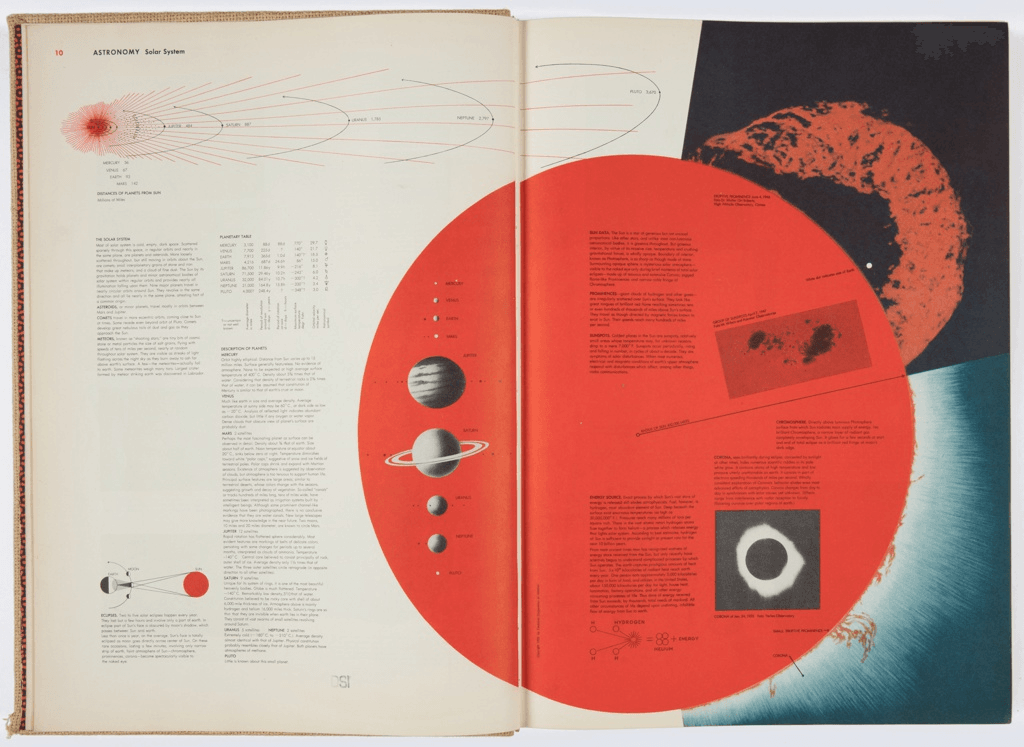
Herbert Bayer was born in 1900 in the Upper Austrian village of Haag am Hausruck. He apprenticed in arts and crafts in Linz and worked in an architecture and design office in Darmstadt in 1920 before enrolling at the Bauhaus in Weimar in 1921. He studied under Wassily Kandinsky and László Moholy-Nagy — the two teachers whose influence runs through everything he did afterwards.

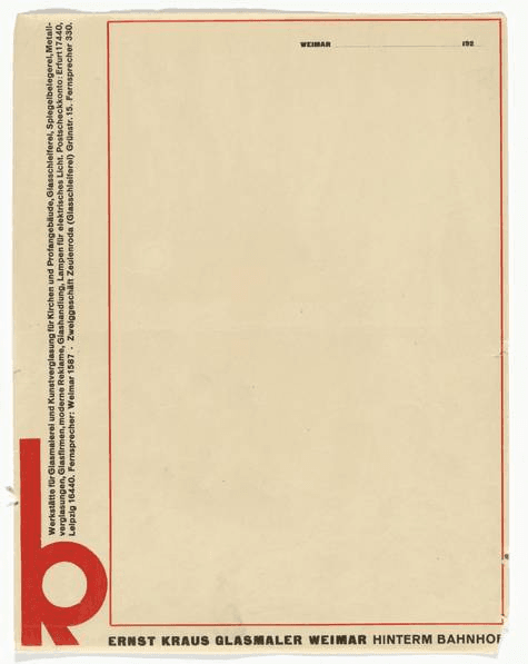
In 1923 he designed a series of ten emergency inflation banknotes for the State Bank of Thuringia, one of the earliest public demonstrations of Bauhaus graphic principles. Two years later, when the Bauhaus moved to Dessau, Gropius appointed him director of the new typography and advertising department. From 1925 to 1928 Bayer established the typographic language that defined the Bauhaus’s output during its most productive period: sans-serif only, lowercase only, asymmetric composition, the grid as a structural given.

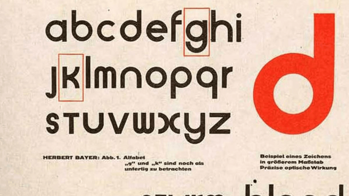
The Universal Typeface, developed in that workshop in 1925, was his most radical single contribution. A geometric alphabet built from circles and bars, it eliminated capital letters altogether. Bayer’s argument was not aesthetic but functional: a technological society should not maintain two alphabets when one would suffice.

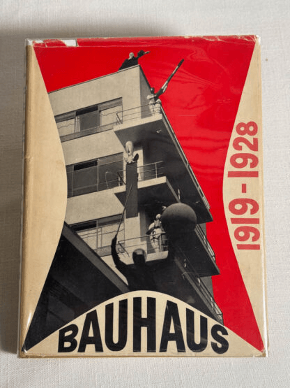
From 1928 to 1938 Bayer worked in Berlin as art director for the Dorland advertising agency, producing photomontage covers for Die Neue Linie and collaborating with former Bauhaus colleagues on major Deutscher Werkbund exhibitions. The political climate of the late 1930s forced his emigration, and in 1938 he moved to New York. He co-designed the Bauhaus 1919–1928 retrospective at the Museum of Modern Art that same year — the exhibition that introduced Bauhaus thinking to American design culture.

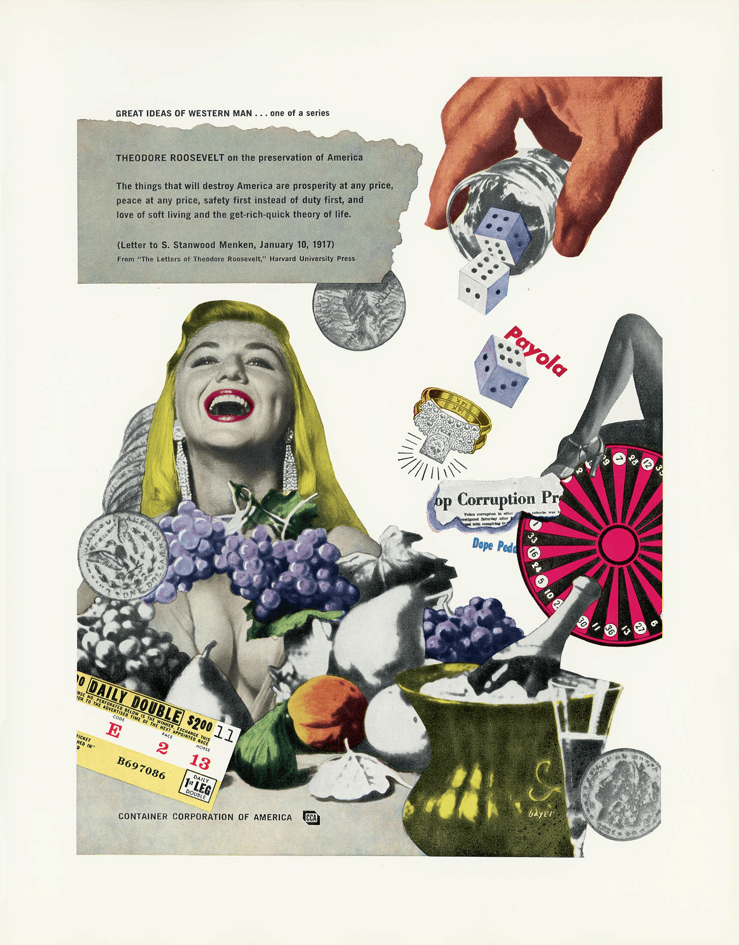
In 1946 Bayer moved to Aspen, Colorado, at the invitation of Container Corporation of America chairman Walter Paepcke. For the next forty years he worked across Container Corporation campaigns (he became chairman of their Design Department in 1956), the Aspen Institute environmental design programme, and the annual International Design Conference he helped found. Aspen’s transformation from a mining town into a cultural institution is in significant part Bayer’s work.

He died in Montecito, California, in 1985 — one of the last surviving figures directly associated with the original Bauhaus teaching staff.

Design philosophy

Bayer’s position, derived directly from the Bauhaus’s Gesamtkunstwerk ideal, was that graphic design is one facet of a total design practice. A designer should be capable of moving between typography, photography, exhibition design, advertising, architecture and environmental design — because visual communication is continuous across all of them.

“What I aim at is a unity of typographical conception, style and form, applied across all the forms of visual communication within a single enterprise.” — Herbert Bayer, on his Container Corporation programme

The Universal Typeface is the clearest public statement of his design logic. Its argument runs as follows: (1) capital letters exist only for historical reasons; (2) maintaining two alphabets doubles the engineering and maintenance burden of type; (3) a rational society should prefer a single-case system designed from first principles. The typeface itself — circles, bars, uniform stroke weight, no calligraphic residue — was the embodiment of that argument.

The wider Bauhaus principle underneath is that form follows function, but function includes social function. A typeface is not just a tool for setting text; it is a position on what a modern society should look like. Bayer never separated the aesthetic claim from the social claim.

His later American work — Container Corporation campaigns, the Aspen Institute, the World Geo-Graphic Atlas — applied the same logic at a larger scale. An atlas is not just a collection of maps; it is a designed information system. A corporate campaign is not just advertising; it is an extended argument about what a company believes.

Key works

Universal Typeface (1925) — The single-case geometric alphabet. Never widely adopted in its original form, but foundational for every geometric sans-serif that followed. Architype Bayer, Jonathan Hoefler’s Bayer Universal and ITC’s revival versions are all direct descendants.

State Bank of Thuringia banknotes (1923) — Series of ten emergency inflation notes. An early public demonstration that Bauhaus principles could work on an official commission.

Bauhaus Dessau printing workshop (1925–1928) — The entire Bauhaus Dessau typographic language: asymmetric layouts, sans-serif headlines, lowercase-only wordmarks, photomontage covers. Effectively the graphic identity of the Bauhaus at its peak.

Bauhaus 1919–1928 at MoMA (1938) — The exhibition — and its catalogue, co-edited with Walter and Ise Gropius — that introduced Bauhaus thinking to American culture.

World Geo-Graphic Atlas (1953) — Produced for Container Corporation of America. An integrated atlas that pioneered what would later be called information design. Bayer combined cartographic rigour, typographic discipline and systematic data visualisation a generation before those terms existed.

Container Corporation of America — Great Ideas of Western Man (1951 onward) — Long-running advertising campaign that paired quotations from Western philosophy with commissioned artwork. Bayer art-directed the programme for decades.

Aspen Institute environmental design (1946–1985) — Sculpture, signage, publications, buildings, and the annual International Design Conference. The Aspen Institute campus is Bayer’s largest single body of work.

Iconic works

Universal Typeface, 1925

Universal Typeface

1925

Geometric single-case alphabet built from circles and bars, developed at the Bauhaus Dessau typography workshop. Bayer eliminated capital letters entirely, arguing that maintaining two case variants was inefficient in a technological society; the proposal was first published in the Bauhaus journal in 1926. Original drawings and design documentation are held by the Bauhaus-Archiv/Museum für Gestaltung, Berlin. Never commercially produced as metal type in its original form, the design influenced every geometric sans-serif that followed, and a digital revival was issued in collaboration with the Bauhaus-Archiv in the 1990s.
Universal Typeface (1925).
State Bank of Thuringia banknotes, 1923

State Bank of Thuringia banknotes

1923

Series of ten emergency currency notes (Notgeld) commissioned by the State Bank of Thuringia during the 1923 German hyperinflation crisis, when the Weimar Bauhaus held a state contract for the work. An early demonstration of Bauhaus graphic principles applied to an official government commission, produced while Bayer was still a student under Moholy-Nagy. Examples are held in the Bauhaus-Archiv/Museum für Gestaltung, Berlin, and in numismatic collections internationally.
State Bank of Thuringia banknotes (1923).
Bauhaus Dessau printing + advertising workshop, 1925-1928

Bauhaus Dessau printing + advertising workshop

1925-1928

Bayer directed the Bauhaus printing and advertising workshop at Dessau, establishing the typographic system used across all Bauhaus publications of the period. The workshop produced the Bauhausbücher series (fourteen volumes, 1925–1930), the Bauhaus journal, and all official Bauhaus printed communications, setting lowercase-only composition, asymmetric grid layouts, and sans-serif type as defining standards. Dessau-period publications are held in major collections including the Bauhaus-Archiv/Museum für Gestaltung, Berlin, and the Museum of Modern Art, New York.
Bauhaus Dessau printing + advertising workshop (1925-1928).
Bauhaus 1919–1928 exhibition design (MoMA), 1938

Bauhaus 1919–1928 exhibition design (MoMA)

1938

Co-designed with Walter Gropius, the exhibition opened at the Museum of Modern Art, New York, on 7 December 1938 and ran until 30 January 1939. It was the first major Bauhaus retrospective in the United States and introduced the movement to the American design establishment. Bayer developed a viewer-centred installation method (angled display panels, objects at eye level, floor graphics) that influenced subsequent exhibition practice; his installation diagrams, published as "Field of Vision" in the catalogue, are held in the MoMA Archives.
Bauhaus 1919–1928 exhibition design (MoMA) (1938).
Container Corporation of America — Great Ideas of Western Man campaign, 1951

Container Corporation of America — Great Ideas of Western Man campaign

1951

Long-running advertising campaign art-directed by Bayer for Container Corporation of America, pairing quotations from Western philosophy with commissioned artworks by prominent American artists including Willem de Kooning, Ben Shahn, and Herbert Matter. The series ran from 1950 until the early 1970s, and Bayer became chairman of the CCA Design Department in 1956. A substantial archive of the campaign is held in the Smithsonian Institution collections, Washington, D.C.
Container Corporation of America — Great Ideas of Western Man campaign (1951).
World Geo-Graphic Atlas, 1953

World Geo-Graphic Atlas

1953

Integrated-information atlas produced for Container Corporation of America, issued in a limited edition of approximately 5,000 copies for distribution to corporate clients and institutions. Bayer combined cartography, typographic system design, and systematic data visualisation into a single coherent publication, a generation before the term "information design" was in common use. The atlas is held in major collections including the Library of Congress, Washington, D.C., and the Museum of Modern Art, New York, and is regularly cited in information-design curricula.
World Geo-Graphic Atlas (1953).
Aspen Institute campus + environmental graphics, 1946-1985

Aspen Institute campus + environmental graphics

1946-1985

Bayer's decades-long environmental design programme for the Aspen Institute in Aspen, Colorado, encompassing sculpture, signage, publications, and the annual International Design Conference he co-founded in 1951. Works on the campus include the earthwork "Grass Mound" (1955), a large-scale earth sculpture now recognised as a precursor to the Land Art movement. The Resnick Center for Herbert Bayer Studies, established at the Aspen Institute in 2019, holds the primary archive of his Aspen-period work.
Aspen Institute campus + environmental graphics (1946-1985).
Bauhaus 1919–1928, 1938

Bauhaus 1919–1928

1938

Catalogue co-edited with Walter Gropius and Ise Gropius for the 1938 MoMA retrospective, published by the Museum of Modern Art, New York. The volume served as the principal English-language reference on the Bauhaus for decades; it has gone through multiple reprints since 1938, including a widely circulated reprint edition, and is held in major art and design library collections worldwide. It remains the standard starting point for English-language Bauhaus scholarship.
Bauhaus 1919–1928 (1938).

Influence & legacy

Bayer is the bridge figure between European modernism and American corporate design. The Universal Typeface itself never took hold commercially — it was too radical, too culturally unfamiliar, too expensive to produce — but its geometric vocabulary became the base DNA for every Futura, Kabel and later geometric sans-serif. Paul Renner’s Futura (1927) emerged in part as a commercial response to Bayer’s experiment.

His American work at Container Corporation of America established the template for serious corporate design departments. The CCA Design Lab under Bayer was effectively the first in-house modernist design studio inside a major American corporation; the model was adopted at IBM, Knoll, CBS, Westinghouse and Container Corporation’s competitors through the 1960s.

The Aspen International Design Conference, which Bayer helped found in 1951, was for three decades the single most important annual meeting of the American design community. It incubated Buckminster Fuller, George Nelson, Eliot Noyes, Saul Bass, Dieter Rams and countless others into sustained professional dialogue.

Bayer’s World Geo-Graphic Atlas is a reference text in information-design curricula to this day. Edward Tufte and subsequent writers on graphic statistics cite it as one of the earliest modern examples of integrated information design.

Every serious Bauhaus retrospective since 1938 — including the 100-year centenary exhibitions of 2019 — treats Bayer as a central figure, second only to Gropius and Moholy-Nagy in terms of the breadth of work produced.

Learn at TGDS

Herbert Bayer sits at the foundation of our typography and identity teaching. If his work interests you, the most direct next steps are:

Courses

  • Certificate IV in Design (CUA40720) — our flagship qualification covers typography fundamentals, grid systems, and the Bauhaus principles that underpin contemporary modernist practice.

Further reading

Books

  • Arthur Cohen, Herbert Bayer: The Complete Work (MIT Press, 1984).
  • Herbert Bayer, Walter Gropius + Ise Gropius (eds.), Bauhaus 1919–1928 (Museum of Modern Art, 1938; multiple reprints).
  • Herbert Bayer, Herbert Bayer: Painter Designer Architect (Reinhold, 1967).
  • Gwen F. Chanzit, From Bauhaus to Aspen: Herbert Bayer and Modernist Design in America (Johnson Books, 2005).

Get Started.

You can enrol any day of the year. We are online and study is self-paced, there is no pressure. Enrol when you are ready to start, from anywhere in the world. If you would like to chat or email, feel free to get in touch.

Brochures, Phone Calls & Questions

You can download a free brochure, book a phone call with one of our course advisors, or simply ask a question.

Other ways to get in touch

Australia 1300 655 485

International +61 1300 655 485

Ask Anything info@thegraphicdesignschool.com

Get a quote accounts@thegraphicdesignschool.com

Acknowledgement of Country
The Graphic Design School acknowledges the Traditional Custodians of Country throughout Australia and their continued spiritual connection to land.
We pay respect to Elders past, present and emerging.
Always was, always will be.
RTO Provider № 91706