Design history · 1920s–1960s

Jan Tschichold

The typographer who wrote the rules, then rewrote them.

Jan Tschichold (1902–1974) is the German typographer whose 1928 manifesto Die neue Typographie gave modernist graphic design its first full rulebook — asymmetry, sans-serif, grid, no centred axis. Two decades later he renounced his own system and rebuilt Penguin Books' classical typography. The trajectory is the canonical case study in rule-making.

Key facts

Born
2 April 1902, Leipzig, Germany
Died
11 August 1974, Locarno, Switzerland
Nationality
German (Swiss resident from 1933)
Era
New Typography · Modernism · Penguin Books house standards
Studios
Self-employed · Penguin Books (typographic consultant, 1947–1949) · Hoffmann-La Roche (1955–1967)
Known for
Die neue Typographie (1928) · Penguin Books typographic standards · Sabon, Transit, Zeus typefaces

Biography

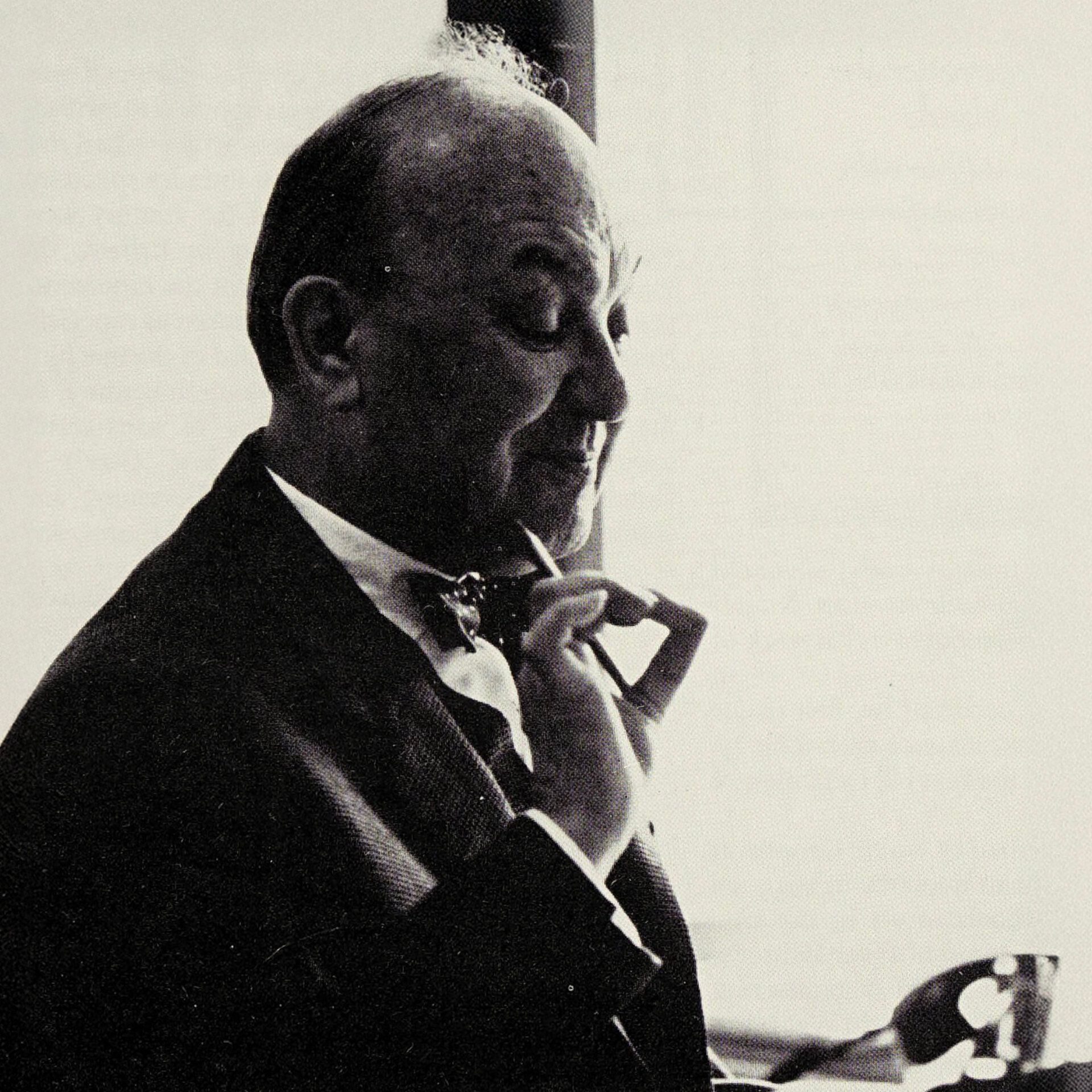
Jan Tschichold was born Johannes Tzschichhold in Leipzig in 1902, the son of a signwriter. His early training was in lettering and calligraphy at the Leipzig Academy of Arts and Crafts — a classical grounding that would sit underneath everything he did for the rest of his life, even during his most rigidly modernist phase.

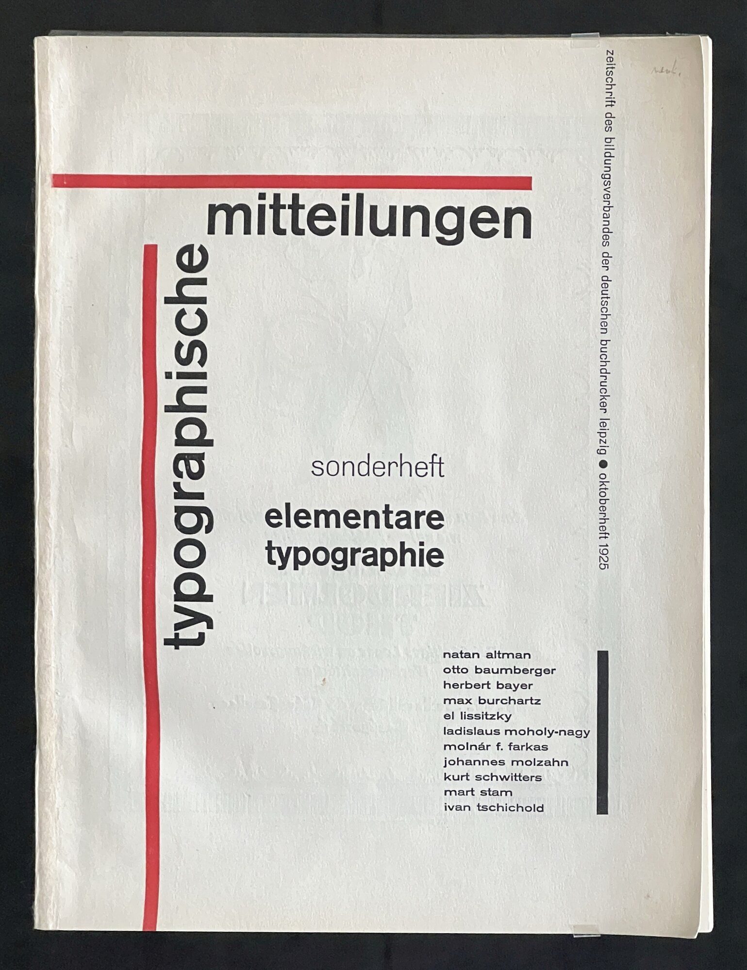
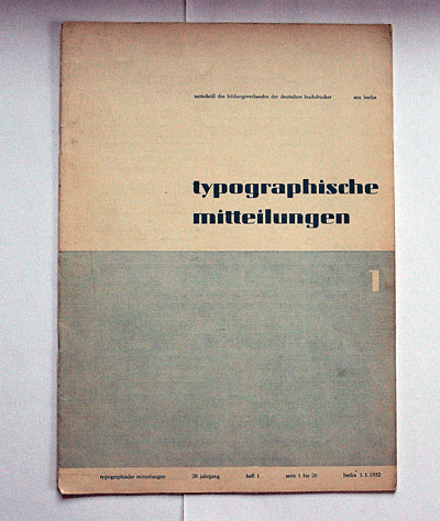
In 1923 Tschichold visited the first Bauhaus exhibition in Weimar. Within two years he had renamed himself (Jan, not Johannes), converted to the European avant-garde, and written elementare typographie — a special issue of Typographische Mitteilungen that reached one hundred thousand working German printers and introduced them to asymmetric, sans-serif, grid-based layout for the first time.

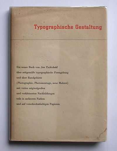
Die neue Typographie followed in 1928. It is a complete manual of modernist graphic design: reject centred axis, abolish ornament, privilege sans-serif, impose the grid, treat design as functional communication. Written for printers rather than theorists, it became the de facto rulebook of European graphic design for the next decade.

In 1933 Tschichold was arrested by the Gestapo and held briefly in Munich before emigrating to Basel. He spent the next four decades in Switzerland, teaching, writing and designing. During his Swiss exile his work softened: the rigid modernism of 1928 gave way to a more historically literate practice.

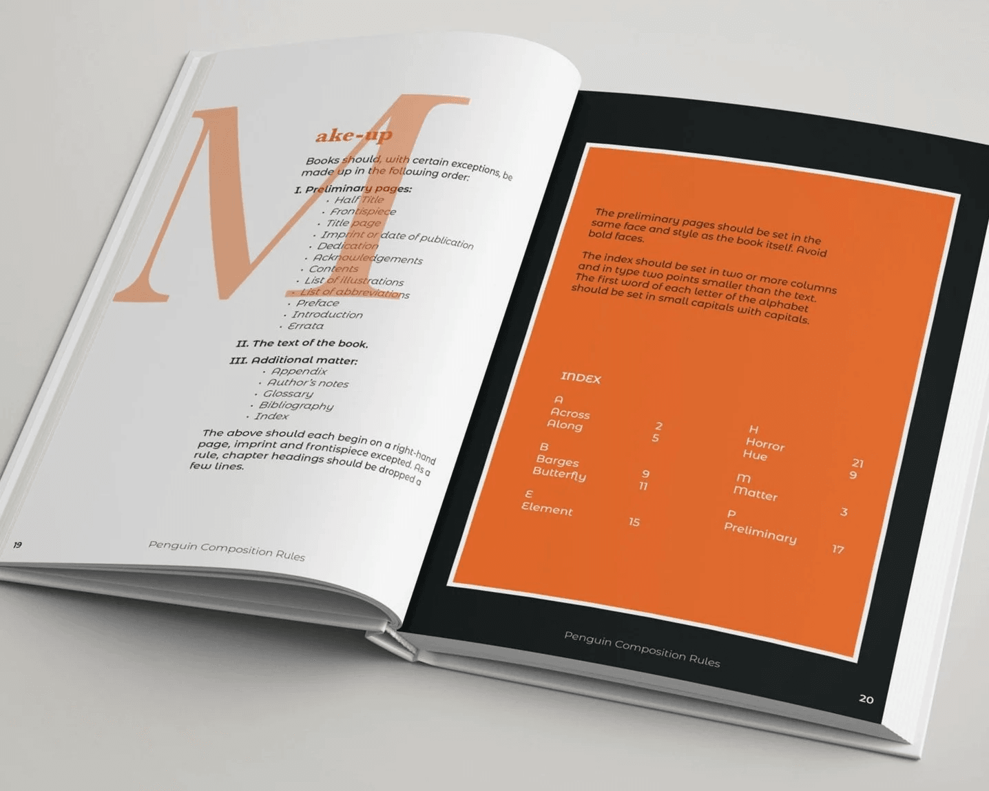
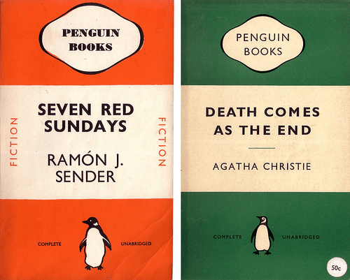
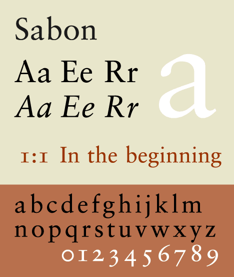
In 1947 he was invited to London by Allen Lane to redesign Penguin Books. Over three years he produced the Penguin Composition Rules and the three-band cover system that would define the publisher’s visual identity for a generation. He then returned to Switzerland and, in 1967, delivered Sabon — the typeface commissioned by Stempel, Linotype and Monotype simultaneously so that the same book could be set consistently across three production systems.

He died in Locarno in 1974, the most influential typographer of the twentieth century to have disavowed his own most famous book.

Design philosophy

Tschichold’s trajectory is the canonical case study in the limits of dogma. In 1928 he wrote, without hedging, that asymmetric sans-serif modernism was the only typography appropriate to the modern age. Centred Roman typography was backward-looking, aesthetically corrupt and politically regressive. The grid was not a preference but a moral position.

“The essence of the New Typography is clarity. This puts it in deliberate opposition to the old typography, whose aim was ‘beauty’ and whose clarity did not attain the high level we require today.” — Jan Tschichold, Die neue Typographie (1928)

By the mid-1930s he had begun to soften. Writing in The Form of the Book (essays collected later), he described his 1928 position as rigid and immature:

“I began to notice most shocking parallels between the teachings of Die neue Typographie and National Socialism and Fascism. Obvious similarities consist of the ruthless restriction of typefaces, a parallel to Goebbels’ infamous Gleichschaltung [forced political conformity].” — Jan Tschichold, from The Form of the Book essays

This is the comparison that makes designers pause. Tschichold did not abandon functionalism; he abandoned the idea that one typographic vocabulary was the only legitimate modern choice. His Penguin work is classical, centred, quiet — and every detail is considered. His later writing argues that craft, craftsmanship and historical literacy are non-negotiable regardless of which tradition a designer works within.

The lasting lesson is not that he was right in 1928 or right in 1947, but that typographic rules should be justifiable from first principles, not inherited as aesthetic allegiance.

Key works

Die neue Typographie (1928) — The manifesto. Eighty-plus rules for modernist graphic design, written for working printers. Remains in print.

elementare typographie (1925) — The special issue of Typographische Mitteilungen that reached a hundred thousand printers and effectively introduced continental modernism to the German print trade.

Penguin Books redesign (1947–1949) — Three-band cover system in classical centred typography. The Penguin Composition Rules, a four-page document, is still circulated as a reference text for book-typography students.

Sabon (1967) — Jointly commissioned by Stempel, Linotype and Monotype to produce a Garamond-derived serif that would set identically across hot-metal, Linotype and film. A rare instance of a typeface designed as a cross-industry standard.

Transit (1931) and Zeus (1931) — His Munich-period display faces. Less-known, but worth citing as evidence that his vocabulary extended well beyond the geometric sans-serifs his manifesto prescribed.

The Form of the Book (1991) — The late essays. The canonical source for Tschichold’s renunciation of his own rules.

Iconic works

Die neue Typographie, 1928

Die neue Typographie

1928

Published by the Bildungsverband der Deutschen Buchdrucker in Berlin. A practical manual for working printers: rejection of centred axis, insistence on asymmetry, sans-serif, the grid, and design as functional communication. An English translation by Ruari McLean was published by University of California Press in 1995 and remains in print.
Die neue Typographie (1928).
Typographische Gestaltung, 1935

Typographische Gestaltung

1935

Published by Benno Schwabe & Co. in Basel, during his years of Swiss exile. A refinement of the 1928 principles, more tolerant of classical forms and historical typography. Known in English as Asymmetric Typography, translated by Ruari McLean and published by Reinhold (New York) in 1967.
Typographische Gestaltung (1935).
The Form of the Book, 1991

The Form of the Book

1991

Originally published in German in 1975, the year after Tschichold's death, with an English translation by Hajo Hadeler published by Hartley & Marks in 1991. The essays span his late career and include his direct renunciation of the 1928 manifesto. Widely held by design libraries as a standard reference on book typography.
The Form of the Book (1991).
Penguin Composition Rules, 1947

Penguin Composition Rules

1947

Written at the request of Allen Lane, founder of Penguin Books, as part of Tschichold's three-year consultancy (1947–1949). Covers paragraph indents, word spacing, running headers, and punctuation conventions in four pages. The original is held in the Penguin Books archive and continues to circulate among book-typography students.
Penguin Composition Rules (1947).
Penguin Books cover redesign, 1947

Penguin Books cover redesign

1947

The three-band horizontal layout (author name, title, publisher imprint) refined Edward Young's 1935 Penguin format with consistent typographic standards across all paperback imprints. Tschichold restyled more than 500 titles during his consultancy, directly contradicting his own 1928 rules. The system ran effectively unchanged for over a decade.
Penguin Books cover redesign (1947).
Sabon typeface, 1967

Sabon typeface

1967

Commissioned jointly by D. Stempel AG, Linotype, and Monotype. Named after Jacques Sabon, a Frankfurt-based type founder who brought Claude Garamond's original punches to Germany in the sixteenth century. The brief required identical output across hot-metal, Linotype, and phototypesetting production systems, a constraint that shaped the typeface's proportions.
Sabon typeface (1967).
Transit typeface, 1931

Transit typeface

1931

Designed while teaching at the Münchner Meisterschule für Deutschlands Buchdrucker (Munich Master School for German Book Printers). A geometric sans-serif consistent with the New Typography principles Tschichold was teaching and practising at the time.
Transit typeface (1931).
Zeus typeface, 1931

Zeus typeface

1931

A display blackletter from his Munich period, designed alongside Transit. Shows that Tschichold was working across the full range of German typographic tradition even during the period most associated with his modernist manifesto.
Zeus typeface (1931).

Influence & legacy

Tschichold’s influence runs on three parallel tracks. The first is direct: Die neue Typographie became the working manual of modernist graphic design in Germany, Switzerland, the Netherlands and the Bauhaus diaspora. The entire Swiss Style tradition — Emil Ruder, Armin Hofmann, Josef Müller-Brockmann — grew from the principles he codified in 1928.

The second is classical. The Penguin Composition Rules made it acceptable for a serious modernist typographer to work within classical book-design conventions — provided every decision was justified by craft logic rather than stylistic allegiance. This licensed a generation of book designers (Derek Birdsall, Jost Hochuli) to refuse the modernist / classical dichotomy altogether.

The third is typographic. Sabon remains one of the most widely used book typefaces in the world. His three-way commissioning model — a single face that sets identically across multiple production systems — prefigured the multi-platform typography brief that dominates contemporary design.

Every serious graphic-design reading list since 1950 includes Tschichold. His renunciation of his own manifesto is part of the curriculum, not an embarrassment to be explained away.

Learn at TGDS

Jan Tschichold sits at the foundation of our typography teaching. If his work interests you, the most direct next steps are:

Courses

Further reading

Books

  • Jan Tschichold, Die neue Typographie: Ein Handbuch für zeitgemäss Schaffende (1928; English translation: The New Typography, University of California Press, 1995).
  • Jan Tschichold, The Form of the Book: Essays on the Morality of Good Design (Hartley & Marks, 1991).
  • Cees W. de Jong + Alston W. Purvis, Jan Tschichold, Master Typographer: His Life, Work and Legacy (Thames & Hudson, 2008).
  • Robin Kinross, Modern Typography: An Essay in Critical History (Hyphen Press, 2nd ed. 2004) — places Tschichold in the broader twentieth-century context.

Online

Get Started.

You can enrol any day of the year. We are online and study is self-paced, there is no pressure. Enrol when you are ready to start, from anywhere in the world. If you would like to chat or email, feel free to get in touch.

Brochures, Phone Calls & Questions

You can download a free brochure, book a phone call with one of our course advisors, or simply ask a question.

Other ways to get in touch

Australia 1300 655 485

International +61 1300 655 485

Ask Anything info@thegraphicdesignschool.com

Get a quote accounts@thegraphicdesignschool.com

Acknowledgement of Country
The Graphic Design School acknowledges the Traditional Custodians of Country throughout Australia and their continued spiritual connection to land.
We pay respect to Elders past, present and emerging.
Always was, always will be.
RTO Provider № 91706