Massimo Vignelli was born in Milan on 10 January 1931. He studied architecture at the Politecnico di Milano and in Venice, and was already designing for Italian glassware and furniture makers before he turned thirty — the beginning of a career that declined to sit inside any single discipline.
In 1957 he married Lella Valle, a fellow architect who would become his design partner for the next fifty-seven years. The Vignellis spent the late 1950s and early 1960s working between Italy and the United States, first on Fulbright fellowships, then on commercial commissions. In 1965 Massimo became a founding partner of Unimark International in Chicago — a modernist practice that brought Helvetica, strict grid systems and International Typographic Style into American corporate work at scale.
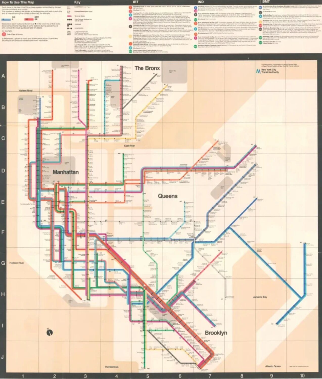
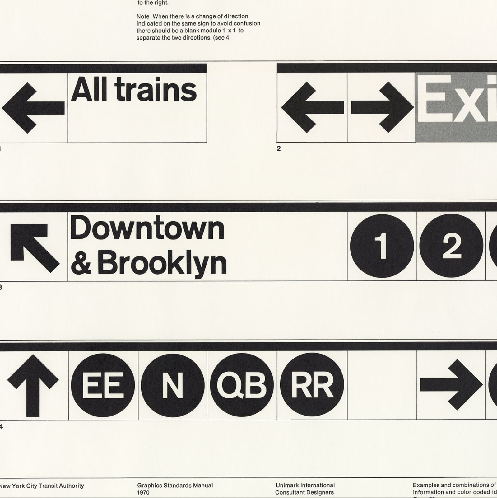
From Unimark’s New York office he led the redesign of the New York City Subway signage system (1966, with Bob Noorda) and, with Joan Charysyn, the 1972 Subway diagram — a purely diagrammatic map that divided critics and commuters for years. The Transit Authority withdrew it in 1979; MoMA collected it in 2004.
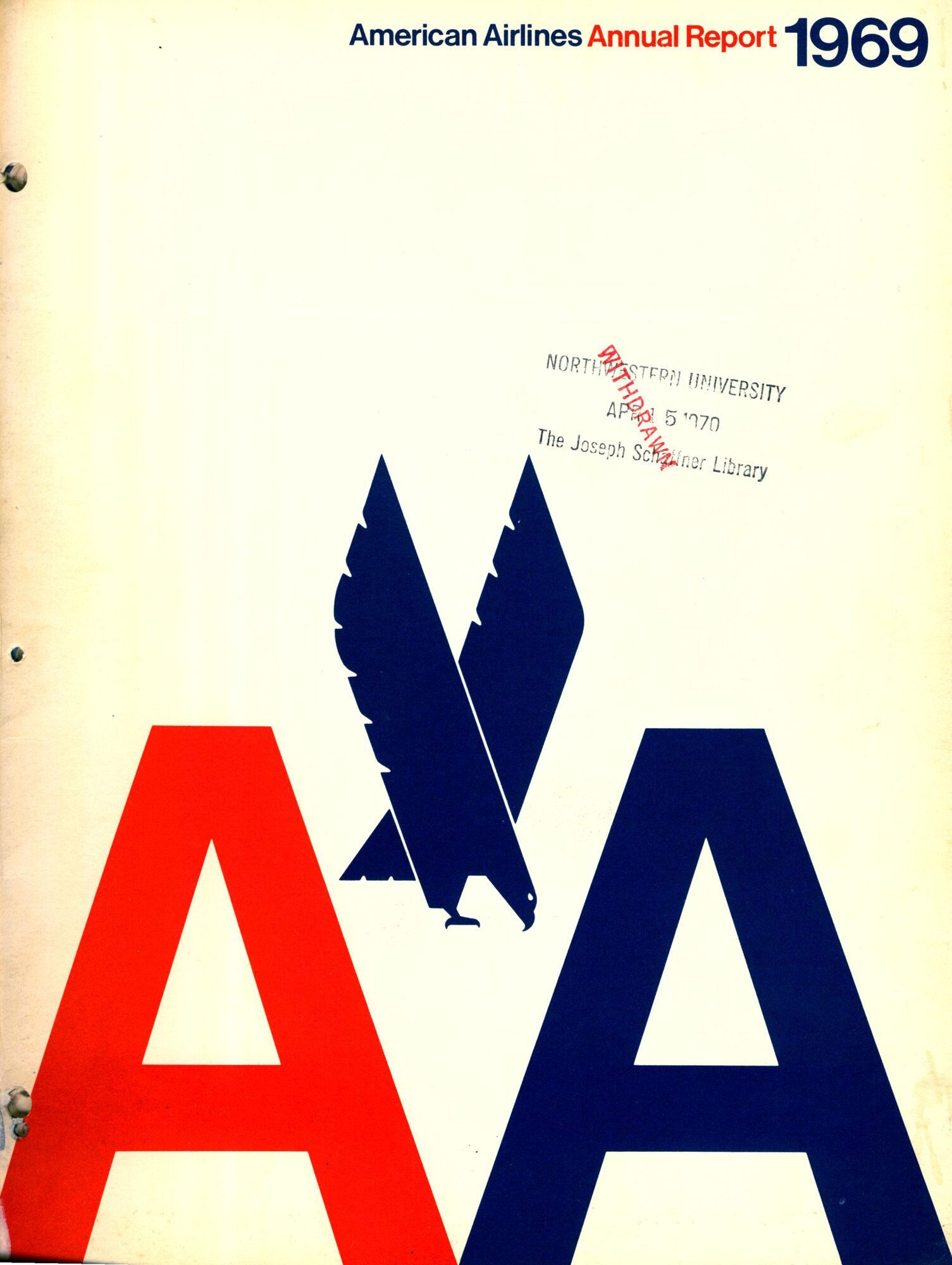
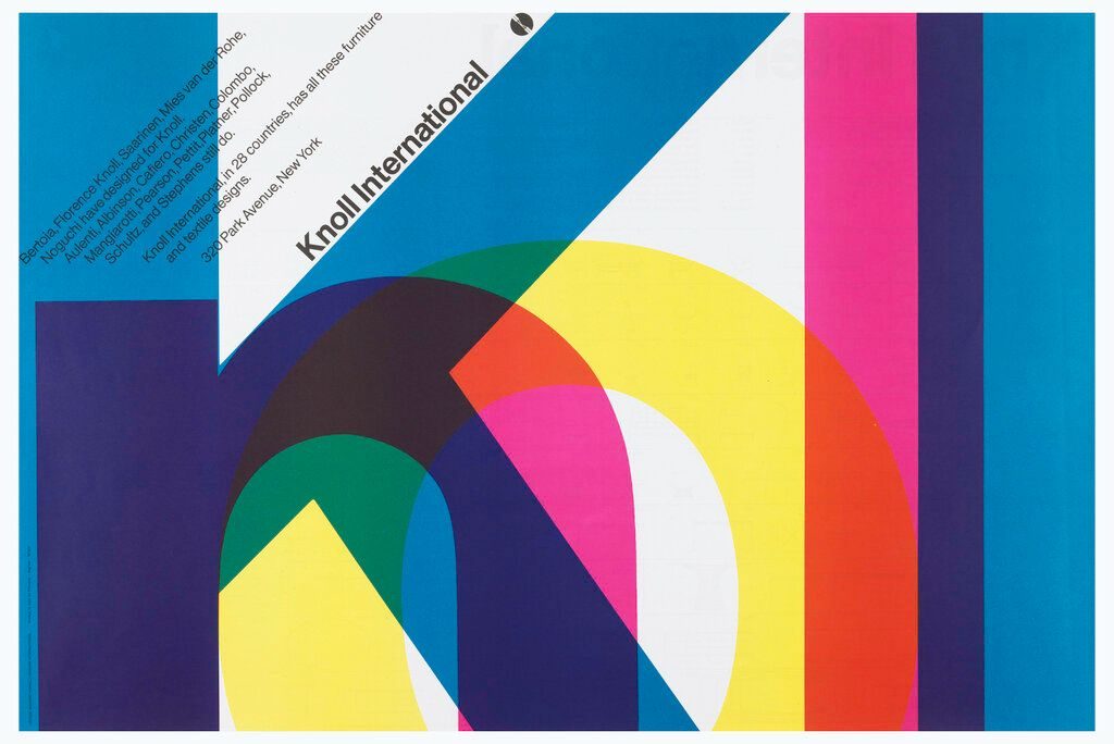
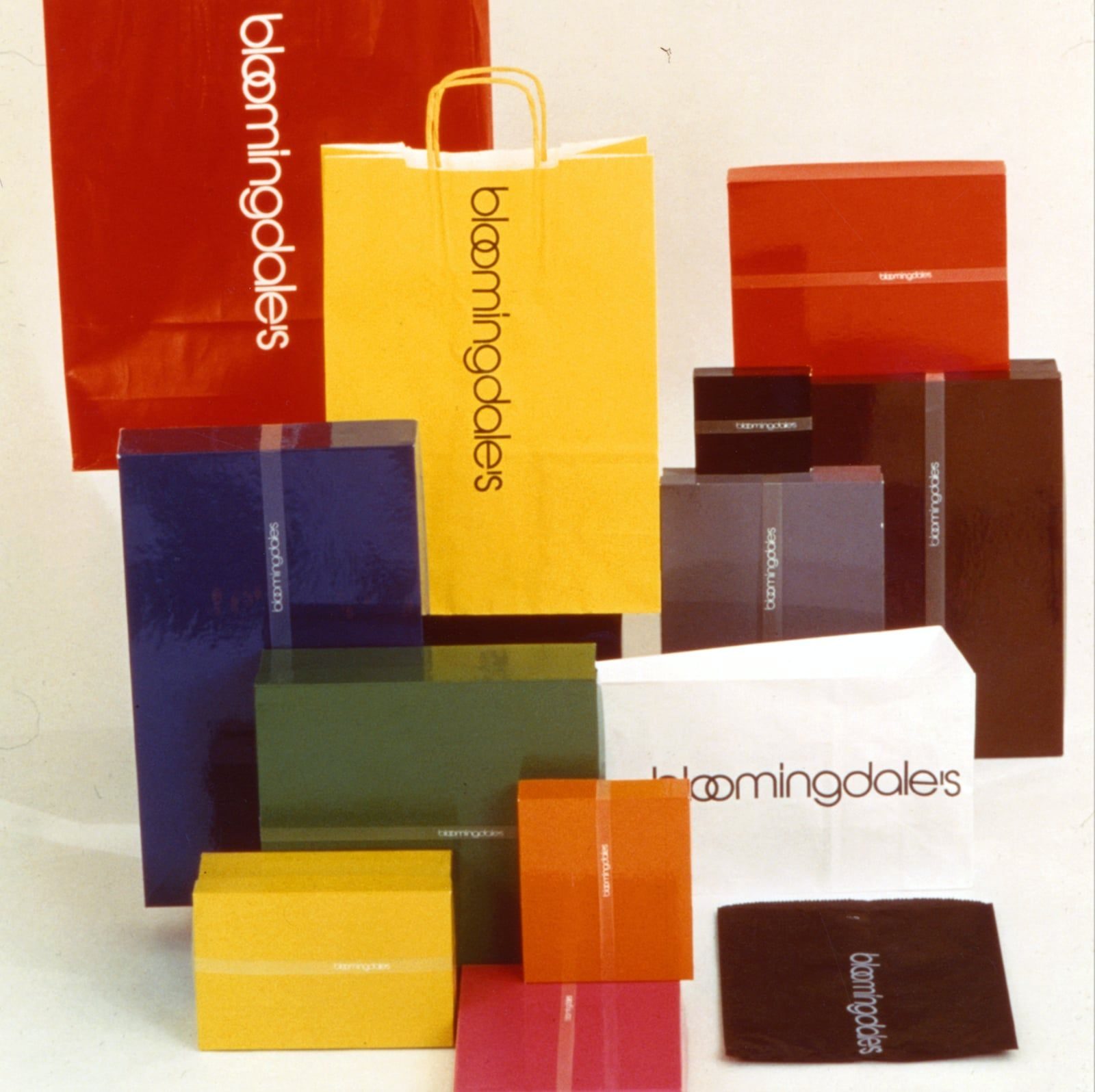
In 1971 the Vignellis left Unimark to found Vignelli Associates in New York. Over the next four decades they produced identity systems for American Airlines, Knoll, Bloomingdale’s, Lancia, Ford, IBM, Xerox and the US National Park Service — work across graphics, furniture, interiors, product design and silverware, all held to the same reductionist logic.
Massimo died in New York on 27 May 2014. The Vignelli Center for Design Studies at Rochester Institute of Technology, established during his lifetime, holds his archive and continues as a teaching resource.