Design history · 2000s contemporary practice

Michael Bierut

The Pentagram partner who reduced corporate identity to the smallest argument that still works.

Michael Bierut (born 1957) is the American graphic designer who, as a partner at Pentagram since 1990, has shaped a generation of contemporary brand identity. His Saks Fifth Avenue, MIT Media Lab, Mastercard and Hillary Clinton 2016 campaign systems demonstrate how much disciplined typography and a strong central idea can carry — and his book How to (2015) is the most-recommended introduction to the working life of a brand designer.

Key facts

Born
29 August 1957, Cleveland, Ohio, USA
Nationality
American
Era
Contemporary practice · Brand identity systems · Editorial design
Studios
Vignelli Associates (1980–1990, design director from 1986) · Pentagram New York (partner since 1990)
Education
B.F.A. Graphic Design, University of Cincinnati College of Design, Architecture, Art and Planning (1980)
Known for
Mastercard logo redesign (2016) · Saks Fifth Avenue identity (2007) · MIT Media Lab identity (2011) · Hillary Clinton 2016 campaign identity · How to · 2008 AIGA Medal

Biography

Michael Bierut grew up in Cleveland, Ohio, the child of a Polish-American family with no design background. He has often credited an early encounter with Massimo Vignelli’s work — particularly the New York subway map and signage — as the moment he understood graphic design was a profession one could enter. He enrolled in the design program at the University of Cincinnati, graduating with a B.F.A. in 1980.

He moved straight to New York and joined Vignelli Associates, where Massimo and Lella Vignelli ran the most disciplined Italian-school practice operating in the United States. Bierut spent ten years there, rising to design director by 1986. The Vignelli aesthetic — Bodoni, Helvetica, grids, restraint, no exceptions — shaped his working vocabulary permanently.

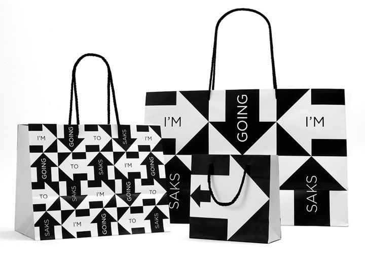
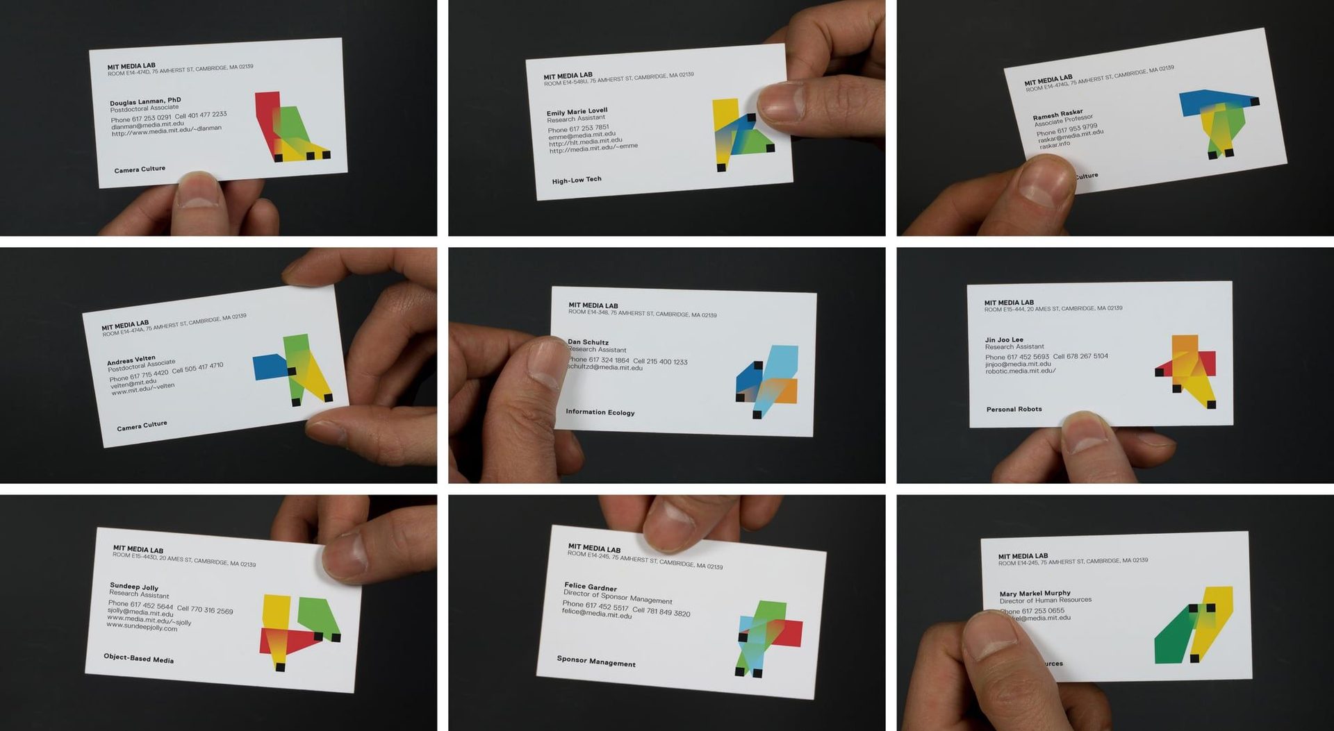
In 1990 he was invited to join Pentagram as a partner in the New York office. He has remained there ever since, currently the longest- serving New York partner. Over three decades he has produced identities for the Council on Foreign Relations, the New York Jets, Princeton University, the New York Times Magazine, MIT Media Lab, Saks Fifth Avenue, Mastercard, the Robin Hood Foundation, Verizon, and the 2016 Hillary Clinton presidential campaign.

He also co-founded Design Observer in 2003 with Jessica Helfand, William Drenttel and Rick Poynor — for nearly two decades the most consistently read independent voice in design criticism — served as AIGA national president (1998–2001), and has taught at Yale School of Art as senior critic for over twenty-five years. He received the AIGA Medal in 2008.

Design philosophy

Bierut’s working method is closer to architecture than to advertising: identify the essential structural problem, find the smallest possible move that resolves it, then defend that move with care. How to is the published expression of this method, but you can read it in any Pentagram presentation he has given.

“Graphic design is the most subjective art form. There are very few objective standards. Most of the things we make can never be tested against anything except another judgement.” — Michael Bierut, How to (2015)

Three commitments organise the work. First, content over style. Bierut’s identities don’t have a “Bierut look” — Saks (1960s revival typography), MIT Media Lab (modular generative system), Mastercard (heritage simplification) and the Hillary campaign (modular wordmark) are formally unrelated. The unifying property is that each system maps cleanly onto the strategic problem.

Second, respect the equity already there. The Mastercard redesign — two circles, two primary colours, refined wordmark — explicitly retains nearly half a century of recognition. Bierut treats heritage marks the way good architects treat heritage buildings: read what is there before you intervene.

Third, write down the argument. Inherited from Rand via Vignelli, reinforced by twenty years of writing for Design Observer. Every Pentagram presentation Bierut has given includes a written rationale. The argument is part of the work.

Key works

Saks Fifth Avenue (2007) — black-and-white wordmark, sliced into sixty-four squares that rearrange across packaging, signage, in-store graphics and seasonal campaigns. A textbook example of a generative identity system that survives unlimited rearrangement without losing legibility.

MIT Media Lab (2011) — designed with Aaron Forrest. Three primitive shapes (square, triangle, circle) and a colour palette generate 40,000 personal identity permutations, one per Lab member. Simplified to a stable core mark in 2014, but the original system is still the teaching reference.

Mastercard (2016) — reduction of Tom Carnase and Bill Pioch’s 1968 mark to its essentials. Two interlocking circles, retained yellow and red, refined wordmark. The wordmark itself was dropped in 2019 — a rare contemporary example of a mark earning the right to stand alone.

Hillary Clinton 2016 campaign (2015) — designed pro bono. The H-with-arrow attracted immediate criticism on launch but proved unusually flexible across thousands of campaign applications, including the colour-shifting versions used to address sub-issues and constituencies during the campaign.

The New York Jets (2024) — return to a refined version of the 1978-1997 wordmark, removing the visual accretions of subsequent redesigns. Late-career restraint as the design move.

Iconic works

Saks Fifth Avenue identity, 2007

Saks Fifth Avenue identity

2007

Commissioned by Saks Fifth Avenue and building on Massimo Vignelli's 1973 cursive wordmark, the identity slices the letterform into a 64-square grid that recombines in any arrangement across packaging, signage and seasonal campaigns. The squares rotate and shuffle while the letterforms remain legible, producing a generative system without a fixed canonical orientation. Designed at Pentagram New York, the project is a standard reference for grid-based permutation systems in brand identity education.
Saks Fifth Avenue identity (2007).
MIT Media Lab identity, 2011

MIT Media Lab identity

2011

Commissioned by MIT Media Lab and designed at Pentagram with Aaron Forrest, the system generates 40,000 unique personal marks from three coloured geometric shapes (square, triangle, circle) that recombine algorithmically, assigning one distinct mark to every Lab member. The concept reflects the Lab's research structure: an institution defined by individual projects requires identities that are simultaneously institutional and singular. A simplified fixed mark replaced the generative permutation system in 2014 as the Lab's primary public-facing identifier.
MIT Media Lab identity (2011).
Mastercard logo redesign, 2016

Mastercard logo redesign

2016

Designed at Pentagram by Bierut with partner Luke Hayman and designers Hamish Smyth, Andrea Trabucco-Campos, Ryan Smith and Tess McCann, and commissioned by Mastercard Global, the identity reduces the 1968 mark to two overlapping circles in original red and yellow, with the intersection resolved to solid orange. A lowercase wordmark in FF Mark typeface was positioned outside the symbol at launch and removed entirely in 2019, leaving the symbol to stand without text. The project is a widely used teaching case for preserving accumulated brand recognition across a significant redesign.
Mastercard logo redesign (2016).
Hillary Clinton 2016 campaign identity, 2015

Hillary Clinton 2016 campaign identity

2015

Designed pro bono by Bierut in collaboration with Jesse Reed of Order design studio and unveiled on 13 April 2015 at the campaign launch, the H-with-forward-arrow mark attracted immediate criticism for its corporate associations. The system was structured for adaptability: the mark shifts colour palettes to address different campaign issues and constituencies, making it functional across merchandise, broadcast graphics and social media at scale. Over eighteen months of active campaigning the flexibility the mark was built around proved more significant than its initial reception.
Hillary Clinton 2016 campaign identity (2015).
New York Jets identity, 2024

New York Jets identity

2024

The Pentagram redesign returns the Jets to the lettering architecture last used between 1978 and 1997, restoring the wordmark to a cleaner state before the visual additions introduced by subsequent redesigns. The 1978 original was drawn by Jim Pons; the 2024 mark preserves that structural logic while removing the accretions of the intervening years. The project is consistent with Bierut's recurring approach of returning to what was already present before the redesign history began.
New York Jets identity (2024).
New York Times Magazine redesigns (multiple)

New York Times Magazine redesigns (multiple)

Pentagram's New York office has worked with the New York Times across several editorial regimes, with the Sunday magazine as a recurring subject. Bierut's involvement spans issue-level identity systems, section header treatments and at least one major structural redesign of the magazine's typographic hierarchy. No single commission date covers the full collaboration; the entries span multiple decades of the Pentagram and Times partnership.
New York Times Magazine redesigns (multiple).
How to: Use Graphic Design to Sell Things, Explain Things, Make Things Look Better, Make People Laugh, Make People Cry, and (Every Once in a While) Change the World, 2015

How to: Use Graphic Design to Sell Things, Explain Things, Make Things Look Better, Make People Laugh, Make People Cry, and (Every Once in a While) Change the World

2015

Published by Harper Design (HarperCollins, ISBN 978-0-06-235202-2), the book collects 35 case studies from Bierut's Pentagram career, each presented with the original brief, the working rationale and the trade-offs that shaped the outcome. The annotated case-study format makes the design process visible rather than presenting finished work, a structure that has since been adopted by other designer-authored monographs. It is a frequently assigned core text in contemporary brand identity and graphic design programmes.
How to: Use Graphic Design to Sell Things, Explain Things, Make Things Look Better, Make People Laugh, Make People Cry, and (Every Once in a While) Change the World (2015).
Now You See It and Other Essays on Design, 2017

Now You See It and Other Essays on Design

2017

Published by Princeton Architectural Press, the volume collects essays originally written for Design Observer (which Bierut co-founded in 2003 with Jessica Helfand, William Drenttel and Rick Poynor) alongside new writing produced for the collection. Topics range from the design of the 2000 US presidential election ballot in Florida to the cultural reception of the Helvetica documentary. The book establishes Bierut's parallel role as a working design critic alongside his practice at Pentagram.
Now You See It and Other Essays on Design (2017).

Influence & legacy

Bierut’s most influential output may not be the identities themselves but the conversation around them. As co-founder of Design Observer (2003), he helped establish the model of the working designer who writes regularly about practice — an approach since adopted by an entire generation of practitioner-critics. The essays collected in Now You See It (2017) cover everything from the Helvetica documentary to the design of voting ballots in Florida.

As a Yale senior critic for over twenty-five years and a teacher at the School of Visual Arts, Bierut has taught (or advised the thesis of) a substantial fraction of the brand-identity profession now in mid-career. The Pentagram New York office — and the broader brand-design profession in New York and London — runs on graduates of his classes.

How to has become the most-recommended single textbook for contemporary brand identity. Its annotated case-study format changed how design monographs are structured: not greatest-hits portfolios, but transparent process documentation with the trade-offs visible.

Learn at TGDS

Bierut’s brand-identity systems map directly onto the most practical modules of our curriculum. If his work interests you, the most direct next steps are:

Courses

  • Certificate IV in Design (CUA40720) — covers the typography, logo design and brand identity foundations Bierut works within.
  • Intensive Foundation Course — 11 modules in typography, layout and identity fundamentals. The same craft underpinning the strategic identity work Bierut practises at Pentagram. Certificate of completion, not the Cert IV.

Further reading

Books

  • Michael Bierut, How to: Use Graphic Design to Sell Things, Explain Things, Make Things Look Better, Make People Laugh, Make People Cry, and (Every Once in a While) Change the World (Harper Design, 2015).
  • Michael Bierut, Now You See It and Other Essays on Design (Princeton Architectural Press, 2017).
  • Michael Bierut, Seventy-Nine Short Essays on Design (Princeton Architectural Press, 2007).

Get Started.

You can enrol any day of the year. We are online and study is self-paced, there is no pressure. Enrol when you are ready to start, from anywhere in the world. If you would like to chat or email, feel free to get in touch.

Brochures, Phone Calls & Questions

You can download a free brochure, book a phone call with one of our course advisors, or simply ask a question.

Other ways to get in touch

Australia 1300 655 485

International +61 1300 655 485

Ask Anything info@thegraphicdesignschool.com

Get a quote accounts@thegraphicdesignschool.com

Acknowledgement of Country
The Graphic Design School acknowledges the Traditional Custodians of Country throughout Australia and their continued spiritual connection to land.
We pay respect to Elders past, present and emerging.
Always was, always will be.
RTO Provider № 91706