Design history · 1980s British postmodernism

Neville Brody

The Face art director who made editorial typography British, expressive and unmistakably his own.

Neville Brody (born 1957) is the British graphic designer and typographer whose The Face magazine art direction (1981–1986) defined 1980s editorial design — and whose subsequent typeface releases (Industria, Insignia, Arcadia, FF Blur) carried that visual language into digital type. His Fuse magazine experiments and current studio practice have shaped how a generation thinks about expressive type as a cultural language.

Key facts

Born
23 April 1957, Southgate, London, UK
Nationality
British
Era
1980s postmodernism · British editorial design · Digital typography
Studios
Stiff Records / Fetish Records (designer, late 1970s–early 1980s) · Neville Brody Studio (founded 1987) · Research Studios (founded 1994, multiple cities) · Brody Associates (current practice)
Education
London College of Printing (B.A. Graphic Design, 1976–1979) · Hornsey College of Art (foundation, 1975)
Known for
The Face magazine art direction (1981–1986) · Arena magazine (1987–1990) · Industria, Insignia, Arcadia and FF Blur typefaces · Fuse magazine (1991–2017) · Royal College of Art Dean of Communication

Biography

Neville Brody was born in Southgate, north London, in 1957. After a foundation year at Hornsey College of Art (1975) he enrolled at the London College of Printing, graduating with a B.A. in Graphic Design in 1979. He has often described his time at LCP as formative chiefly through opposition: the school taught Swiss-school typographic discipline rigorously, and Brody — already politically and aesthetically aligned with the British punk and post-punk cultural moment — set out to break it.

His early commercial work was for independent record labels: Stiff Records, then Fetish Records, where he developed a visual language that mixed punk DIY with constructivist composition and hand-drawn lettering. The record sleeves caught the attention of Nick Logan, who in 1981 hired the twenty-four-year-old Brody as art director of his new style magazine, The Face.

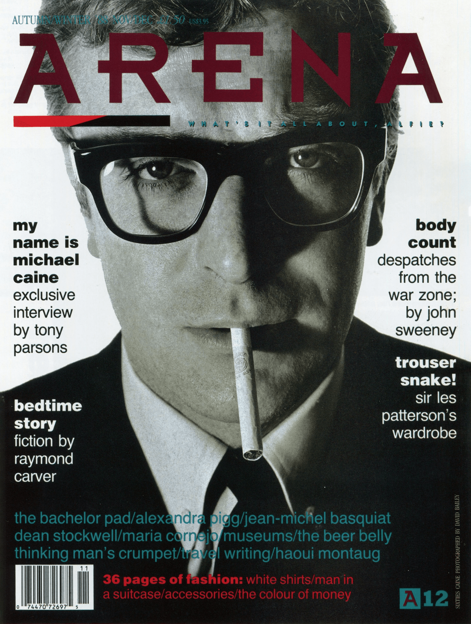
The five-year tenure at The Face (1981–1986) is the work for which Brody remains most widely known. He treated each issue as a typographic experiment: hand-drawn folios, custom display lettering, deliberate grid violations, the use of marks and symbols as editorial typography. By 1985 the magazine’s visual language was being copied across the Anglo-American magazine industry. Brody pivoted hard to a stripped modernism for Arena (1987–1990) — partly, he has said, as a deliberate counter-move to the imitators the Face work had spawned.

In 1987 he founded Neville Brody Studio, then in 1994 the broader multi-city Research Studios practice (London, Paris, Berlin, Barcelona). Through the 1990s and 2000s the studio worked across identity, editorial, packaging, broadcast and digital — clients included The Times, BBC, Channel 4, Premier League, Coca-Cola, Nike, Sony, and the Greek government for the Athens 2004 Olympics signage. He also co-founded Fuse magazine with Jon Wozencroft in 1991, an experimental typography publication that shipped quarterly with new contributor-designed typefaces.

From 2011 to 2018 Brody served as Dean of the School of Communication at the Royal College of Art. He continues active design practice through Brody Associates.

Design philosophy

Brody’s typographic position is anti-Swiss in the original sense — not hostile to discipline, but hostile to the idea that a single typographic system can serve every editorial brief. Type, in his reading, is a cultural and emotional medium first; the rules of legibility and grid are tools, not laws.

“The notion of taking a typeface that someone else has designed and then applying it to your work — to me that’s the same as a writer borrowing someone else’s words.” — Neville Brody, The Graphic Language of Neville Brody (1988)

Three commitments organise the work. First, type as voice. Each Face article got its own typographic treatment because each article had its own voice. The grid and the typeface were chosen for the content, not imposed on it. The discipline was content-first; the consequence looked like indiscipline only to readers expecting the Swiss model.

Second, draw it yourself. Brody’s Face-era custom lettering and his subsequent commercial typefaces (Industria, Insignia, Arcadia, FF Blur) all emerge from the same instinct: if the typeface you need doesn’t exist, make it. The typographer-as-author position that David Carson, Jonathan Barnbrook and Jonathan Hoefler would later occupy was made plausible by Brody first.

Third, type is political. Fuse — the floppy-disk-shipped experimental typography quarterly — was framed explicitly as a challenge to the corporate ownership of digital type. Each issue assigned a theme (Religion, Crash, Fundamentalism, Disinformation) and asked contributors to respond with a typeface. Type as cultural commentary, distributed at the speed of postal subscription.

Key works

The Face magazine (1981–1986) — five years of monthly editorial typographic invention. The body of work that broke the Swiss editorial grid for the British style press and was then copied worldwide. The 1988 Thames & Hudson monograph The Graphic Language of Neville Brody documented the run.

Arena magazine (1987–1990) — Logan’s men’s title, art-directed as a deliberate stripped counter-statement to the Face style after it had been over-imitated. Helvetica, white space, restraint. A lesson in not getting trapped by your own signature.

Industria, Insignia, Arcadia (1989–1990) — the first commercial Linotype releases of the typefaces Brody had drawn for the magazines. Carried the Face and Arena visual language onto designers’ desktops worldwide.

FF Blur (1992) — three-weight FontFont release. Photographically blurred letterforms, shipped natively in early Mac OS, used everywhere in 1990s music and editorial design. The first widely-licensed typeface explicitly about reproduction itself.

Fuse magazine (1991–2017) — eighteen quarterly issues plus the retrospective Fuse 1-20 (Taschen, 2012). Co-founded with Jon Wozencroft. Shipped with floppy/CD/digital typefaces commissioned around themes (Religion, Crash, Disinformation). The most influential single venue for experimental digital typography of the 1990s.

Iconic works

The Face magazine art direction, 1981/1986

The Face magazine art direction

1981/1986

Five years as art director of Nick Logan's monthly British style magazine, published by Wagadon Ltd. Brody dismantled the Swiss editorial grid in public through hand-drawn page numbers, custom display lettering, and deliberate violations of every typographic rule he had been taught at LCP. A retrospective exhibition of the work was mounted at the Victoria and Albert Museum, London, in 1988, accompanying the Thames & Hudson monograph published that year. The single most-imitated body of editorial design of the decade.
The Face magazine art direction (1981/1986).
Arena magazine art direction, 1987/1990

Arena magazine art direction

1987/1990

Sister men's title to The Face, also published by Wagadon Ltd for Nick Logan, and considered the UK's first dedicated men's style magazine. Brody pivoted hard from the expressive Face style to a stripped, almost severe modernist typography, a deliberate counter-move to the imitators his Face work had spawned. The Arena typographic system was documented alongside the Fuse work in volume two of the Thames & Hudson monograph (1994).
Arena magazine art direction (1987/1990).
Industria typeface, 1989

Industria typeface

1989

Geometric sans drawn initially for Arena magazine, released commercially through Linotype in two weights (regular and inline). Used widely throughout the late 1980s and 1990s in editorial and corporate identity. The typeface remains in distribution through Monotype, which acquired Linotype in 2006.
Industria typeface (1989).
Insignia typeface, 1990

Insignia typeface

1990

Geometric, condensed display sans released through Linotype, originally drawn for The Face. Issued commercially in 1990 as part of Brody's Linotype series alongside Arcadia, available in a single weight with distinctive parallel stroke decoration drawn from his magazine lettering. One of the early commercial digital typefaces with a distinctly British postmodern voice.
Insignia typeface (1990).
Arcadia typeface, 1990

Arcadia typeface

1990

Tall, narrow, expressive display face released through Linotype in 1990 as the third in Brody's commercial series alongside Industria and Insignia. Continued the experimental late-Face direction in commercially available form. The most overtly constructivist of the three Linotype releases, it drew directly on the hand-lettered display work Brody had produced for record sleeves and The Face.
Arcadia typeface (1990).
FF Blur typeface family, 1992

FF Blur typeface family

1992

Three-weight family published by FontShop International as part of the FF (FontFont) library, co-founded by Brody and Erik Spiekermann in 1990 to distribute independent type designers' work. Photographically blurred letterforms, a direct comment on what digital reproduction was doing to type. Widely licensed across 1990s music and editorial design, the typeface remains in distribution through Monotype, which acquired the FontFont library in 2014.
FF Blur typeface family (1992).
Fuse magazine and conference series, 1991/2017

Fuse magazine and conference series

1991/2017

Co-founded with Jon Wozencroft in 1991. Quarterly experimental typography publication shipped with floppy disk (later CD-ROM, then digital download) of contributor-designed typefaces, each issue built around a thematic brief (Religion, Crash, Disinformation, and others). Eighteen quarterly issues were published; the Fuse 1-20 retrospective (Taschen, 2012), edited by Brody and Wozencroft, reproduces all commissioned typefaces alongside critical essays. The most influential single venue for experimental digital type in the 1990s.
Fuse magazine and conference series (1991/2017).
The Graphic Language of Neville Brody, 1988

The Graphic Language of Neville Brody

1988

Thames & Hudson. Authored by Jon Wozencroft. Published to coincide with a major retrospective exhibition of Brody's work at the Victoria and Albert Museum, London. Documented Brody's Face-era work and made his approach a permanent reference point for editorial design teaching. A second volume followed in 1994.
The Graphic Language of Neville Brody (1988).
The Graphic Language of Neville Brody 2, 1994

The Graphic Language of Neville Brody 2

1994

Thames & Hudson. Volume 2 extended the documented record to cover the Arena work, the early Linotype type releases, and the first three years of Fuse. The pairing of the two volumes remains the standard published account of Brody's career through the mid-1990s.
The Graphic Language of Neville Brody 2 (1994).

Influence & legacy

Brody’s influence runs in two directions. Editorially, his Face work made it acceptable for British and American magazine art direction to break from the Swiss editorial grid — a permission slip that David Carson, Vince Frost, Jeffrey Keedy and the broader late-1980s and 1990s magazine-design generation cashed in immediately. The current state of British editorial design — Wallpaper, Monocle, The Gentlewoman, even the editorial layers of The Guardian — is unimaginable without that permission.

Typographically, his commercial typeface releases (Industria, Insignia, Arcadia, Blur) and his curatorial work on Fuse made the designer-as-type-author career path commercially viable. The route that Hoefler & Co., House Industries, Underware, and now hundreds of independent type foundries occupy was, in 1990, much narrower.

As Dean of School of Communication at the Royal College of Art (2011–2018) Brody also shaped a generation of British and international graphic designers and typographers directly. His teaching position has been less visible than his commercial work but arguably more durable.

Learn at TGDS

Brody’s editorial and typographic work connects to several modules of our curriculum. If his approach interests you, the most direct next steps are:

Courses

  • Certificate IV in Design (CUA40720) — covers the editorial typography and grid foundations Brody worked within and against.
  • Intensive Foundation Course — 11 modules in typography, layout and image-making. The same craft Brody pushed through The Face into expressive editorial typography. Certificate of completion, not the Cert IV.

Further reading

Books

  • Jon Wozencroft, The Graphic Language of Neville Brody (Thames & Hudson, 1988).
  • Jon Wozencroft, The Graphic Language of Neville Brody 2 (Thames & Hudson, 1994).
  • Neville Brody & Jon Wozencroft, Fuse 1-20: From Invention to Antimatter — Twenty Years of FUSE (Taschen, 2012).
  • Lewis Blackwell, The End of Print: The Graphic Design of David Carson (Laurence King, 1995) — useful comparison reading on the post-Brody generation.

Online

Get Started.

You can enrol any day of the year. We are online and study is self-paced, there is no pressure. Enrol when you are ready to start, from anywhere in the world. If you would like to chat or email, feel free to get in touch.

Brochures, Phone Calls & Questions

You can download a free brochure, book a phone call with one of our course advisors, or simply ask a question.

Other ways to get in touch

Australia 1300 655 485

International +61 1300 655 485

Ask Anything info@thegraphicdesignschool.com

Get a quote accounts@thegraphicdesignschool.com

Acknowledgement of Country
The Graphic Design School acknowledges the Traditional Custodians of Country throughout Australia and their continued spiritual connection to land.
We pay respect to Elders past, present and emerging.
Always was, always will be.
RTO Provider № 91706