Design history · 1950s–1980s

Otl Aicher

The German designer who turned corporate identity into civic infrastructure.

Otl Aicher (1922–1991) is the German graphic designer who co-founded the Hochschule für Gestaltung Ulm and built the visual identity of the 1972 Munich Olympics — including the pictogram system that every subsequent Games has adapted. His work for Lufthansa, Braun and ERCO defined post-war European corporate design.

Key facts

Born
13 May 1922, Ulm, Germany
Died
1 September 1991, Günzburg, Germany
Nationality
German
Era
Post-war modernism · Ulm School · Corporate design systems
Studios
Hochschule für Gestaltung Ulm (co-founder, 1953–1968) · Büro Aicher, Rotis (Isny im Allgäu)
Known for
Munich 1972 Olympic identity & pictograms · Lufthansa (1962) · Braun · ERCO · Rotis typeface family (1988)

Biography

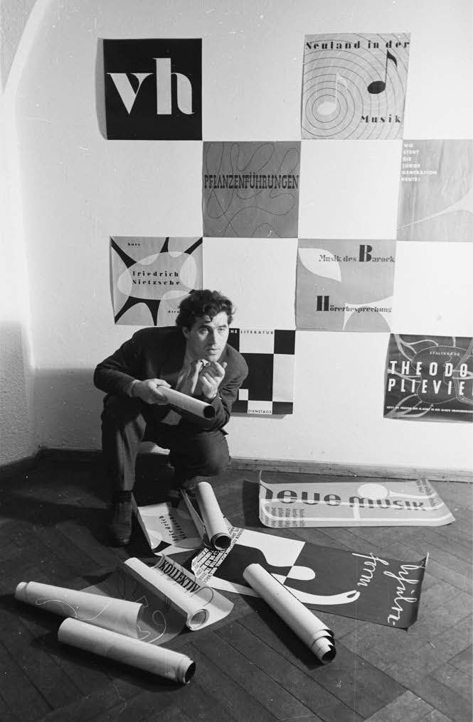
Otto “Otl” Aicher was born in Ulm in 1922. As a teenager he refused membership of the Hitler Youth and was later arrested by the Gestapo for his friendship with the Scholl siblings, Hans and Sophie, who led the White Rose anti-Nazi resistance. He deserted from the Wehrmacht in 1945 and returned to Ulm at the end of the war.

In 1946–1947 he studied briefly at the Academy of Fine Arts in Munich, then returned to Ulm to set up his own studio. In 1952 he married Inge Scholl — Hans and Sophie’s surviving sister — and together with Max Bill they founded the Hochschule für Gestaltung Ulm, which opened in 1953. HfG Ulm became the most influential post-war design school in Europe, carrying forward Bauhaus thinking into the industrial age. Aicher taught there until the school was closed in 1968.

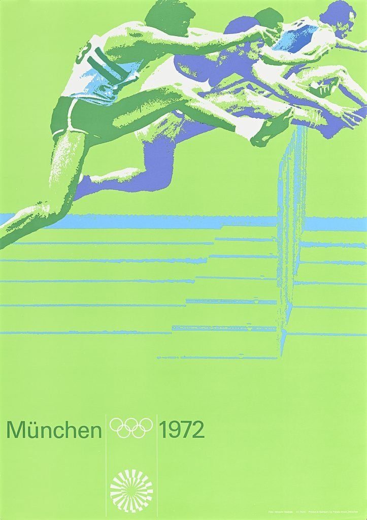
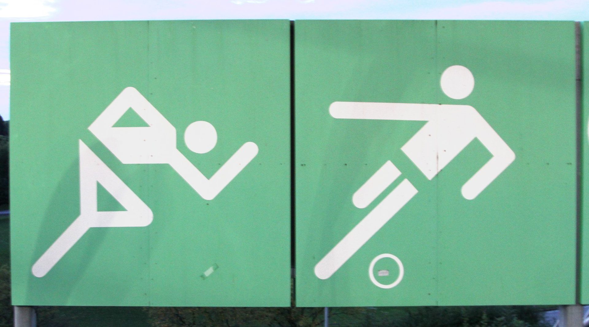
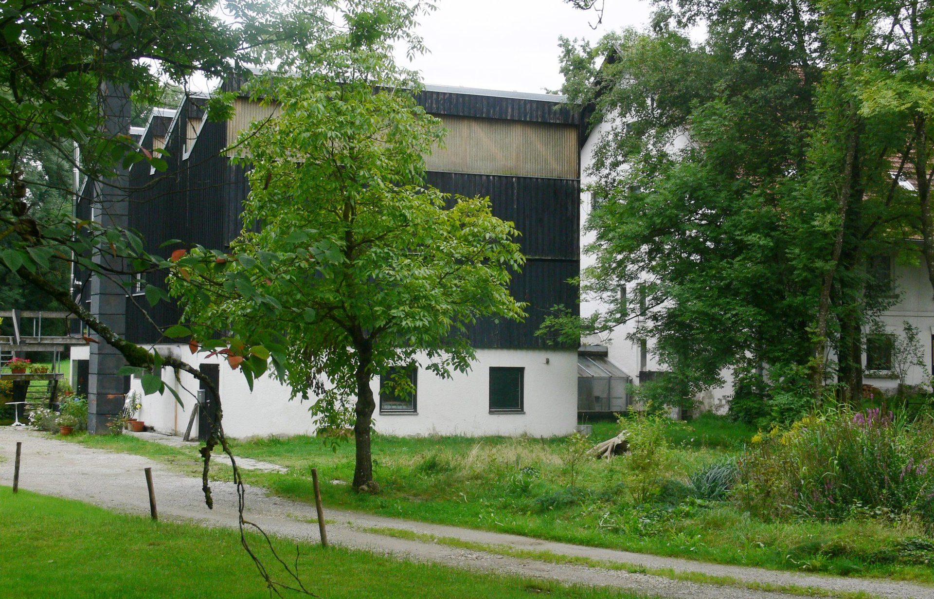
From the late 1960s he ran his practice from a converted farmhouse in Rotis, near Isny im Allgäu — the studio known as Büro Aicher. His largest single commission was the visual identity for the 1972 Munich Olympics, won by competition in 1967 and delivered across five years.

He died in a traffic accident in Günzburg on 1 September 1991, aged 69.

Design philosophy

Aicher argued that graphic design is a branch of public infrastructure — the same kind of civic work as road signage, postal services or currency. A mark or a typeface should not express the designer; it should let a large institution speak clearly to millions of people, across decades, without getting in the way.

His second premise was the total system. An identity is not a logo — it is a complete programme of typography, colour, grid, photography, pictograms and signage, designed together so that any single element works only because the whole works. The Munich 1972 identity is the textbook example: a single logic runs from stamps and tickets through venue wayfinding to the mascot.

His third position was that typography carries meaning before it carries words. Rotis, his 1988 type family, was built so that a designer could move from a fully geometric sans through three intermediate stages to a fully humanist serif — choosing a tonal register the way a writer chooses a voice.

Key works

Munich 1972 Olympic identity (1967–1972) — the entire visual programme of the XX Olympiad: colour palette, typography, wayfinding, posters, publications, tickets and the dachshund mascot “Waldi”. The first Games after Tokyo 1964 to be designed as an integrated system, and the reference point every host city has worked from since.

Munich 1972 Olympic pictograms — a geometric pictogram set built on a strict grid of horizontal, vertical and 45-degree strokes. The system was adopted, adapted and extended by subsequent Games and has become the international standard for sports signage.

Lufthansa corporate identity (1962) — developed with students at HfG Ulm. The existing crane mark was retained but the typography, livery and full communications programme were rebuilt as a single yellow-and-blue system. Lufthansa is still recognisably Aicher.

Braun collaboration (1954 onwards) — long-running work with Braun AG in Kronberg that ran in parallel to Dieter Rams’s product design. Catalogues, exhibition stands and communications that fixed Braun’s modernist visual register.

ERCO corporate identity (1974) — systematic identity for ERCO Leuchten’s architectural lighting business. The catalogue system in particular is cited as a model for technical-publication design.

Isny im Allgäu identity — an ongoing tourism and civic identity for Aicher’s adopted home town, built around a distinctive woodcut- style pictogram series.

Rotis typeface family (1988) — four-variant type system spanning sans, semi-sans, semi-serif and serif, intended to work as one family across the full range from geometric to humanist.

Iconic works

Munich 1972 Olympic Games visual identity, 1967/1972

Munich 1972 Olympic Games visual identity

1967/1972

Complete visual identity for the XX Olympiad in Munich, commissioned following an open design competition held in 1967 by the Organizing Committee for the Games of the XX Olympiad. The programme covered colour palette, typography, wayfinding, publications, postage stamps and the dachshund mascot 'Waldi', all governed by a single visual grammar developed by Aicher's team across five years. Original design manuals and production documentation are archived at the Deutsches Olympisches Museum in Cologne.
Munich 1972 Olympic Games visual identity (1967/1972).
Munich 1972 Olympic pictograms, 1972

Munich 1972 Olympic pictograms

1972

Geometric pictogram set designed for the Munich Games, built on a fixed grid of horizontal, vertical and 45-degree strokes that allowed each figure to be reproduced at any scale without loss of legibility. Aicher's team produced pictograms for 21 Olympic sports and 18 non-Olympic sports, later extended for the Paralympic Games. Every subsequent Olympic host city has either adapted Aicher's originals directly or worked from the same underlying grid logic.
Munich 1972 Olympic pictograms (1972).
Lufthansa corporate identity, 1962

Lufthansa corporate identity

1962

Full corporate identity commissioned by Deutsche Lufthansa AG and developed with students at HfG Ulm, one of the first systematic identity programmes produced for a European flag carrier. The existing crane mark was retained, but aircraft livery, uniforms, printed communications and signage were rebuilt as a unified yellow-and-blue system with a defined grid and type hierarchy. The identity, updated incrementally, remained recognisable until Lufthansa's rebrand in 2018.
Lufthansa corporate identity (1962).
Braun brand identity and design collaboration, 1954/1980

Braun brand identity and design collaboration

1954/1980

Long-running visual communication work for Braun AG in Kronberg im Taunus, covering product brochures, packaging inserts, exhibition stands and trade publications across more than two decades. The collaboration ran in parallel with Dieter Rams's product design programme, and together the two practices fixed the modernist visual and material register that defined Braun's international reputation. Original Aicher-designed Braun print material is held in design history collections in Germany.
Braun brand identity and design collaboration (1954/1980).
ERCO lighting corporate identity, 1974

ERCO lighting corporate identity

1974

Corporate identity commissioned by ERCO Leuchten GmbH in Lüdenscheid, covering technical catalogues, signage and all printed communications for the architectural lighting manufacturer. Aicher treated the product catalogue as a primary design artefact, developing a typographic and illustration system that set a reference point for technical publications in the building-product sector. The programme remained in use, with incremental revisions, through the 1980s and 1990s.
ERCO lighting corporate identity (1974).
Rotis typeface family, 1988

Rotis typeface family

1988

Four-variant type family released in 1988 by Linotype-Hell AG, named after the hamlet of Rotis in Isny im Allgäu where Aicher's studio was based. Rotis Sans Serif, Rotis Semi Sans, Rotis Semi Serif and Rotis Serif share common proportions and spacing metrics, allowing movement between geometric and humanist registers within a single typographic system. The family has remained in commercial release and is distributed by Monotype as part of the Linotype catalogue.
Rotis typeface family (1988).
Typographie, 1988

Typographie

1988

Published by Ernst & Sohn, Berlin in 1988, co-authored with designer Josef Rommen. The book sets out Aicher's argument that typography functions as civic communication, demanding the same clarity and consistency as public signage or official documents. It is cited in European design education as a concise account of the Ulm approach to typographic thinking.
Typographie (1988).
Die Welt als Entwurf / The World as Design, 1991

Die Welt als Entwurf / The World as Design

1991

Published by Ernst & Sohn, Berlin in 1991, the year Aicher died. The German title translates as 'The World as Design', and an English edition under that title was published by Ernst & Sohn in 1994. The essays argue that design constitutes a distinct mode of engaging with the world, separate from both science and art, and that making things functional and legible for other people is a form of civic responsibility.
Die Welt als Entwurf / The World as Design (1991).

Influence & legacy

Aicher’s Munich 1972 pictograms are the single most-copied piece of graphic design in the world — every subsequent Olympic Games, most airports, and the overwhelming majority of public-wayfinding systems trace their visual language back to that set. The AIGA/DOT symbol signs in the United States (1974) were built directly on Aicher’s grid logic.

His work at HfG Ulm shaped two generations of European designers and informed the systematic corporate-identity programmes that followed — at Lufthansa, Braun, ERCO and beyond. The Ulm method, transmitted through his students and through the many Braun, Lufthansa and ERCO alumni, still underlies most large-scale European identity work.

Rotis divides opinion — it is used everywhere from university prospectuses to municipal signage, and has been both praised for its ambition and criticised for its legibility at small sizes. Either way it is one of the most-discussed typefaces of the late twentieth century.

Aicher received the Bundesverdienstkreuz (German Federal Cross of Merit) and a Gold Medal at the Brno Biennial, among other honours.

Learn at TGDS

Aicher sits in the background of how we teach identity, wayfinding and systematic typography. If his work interests you, the most direct next steps are:

Courses

Further reading

Books

  • Otl Aicher, Typographie (Ernst & Sohn, 1988) — with Josef Rommen.
  • Otl Aicher, Die Welt als Entwurf / The World as Design (Ernst & Sohn, 1991).
  • Markus Rathgeb, Otl Aicher (Phaidon Press, 2006) — the definitive English-language monograph.
  • Eva Moser, Otl Aicher: Gestalter (Hatje Cantz, 2012).
  • HfG Ulm: Concise History of the Ulm School of Design (René Spitz, Axel Menges, 2002).
  • Jens Müller & Karen Weiland, Logo Modernism (Taschen, 2015) — contextualises Aicher’s Lufthansa, ERCO and Braun marks.

Get Started.

You can enrol any day of the year. We are online and study is self-paced, there is no pressure. Enrol when you are ready to start, from anywhere in the world. If you would like to chat or email, feel free to get in touch.

Brochures, Phone Calls & Questions

You can download a free brochure, book a phone call with one of our course advisors, or simply ask a question.

Other ways to get in touch

Australia 1300 655 485

International +61 1300 655 485

Ask Anything info@thegraphicdesignschool.com

Get a quote accounts@thegraphicdesignschool.com

Acknowledgement of Country
The Graphic Design School acknowledges the Traditional Custodians of Country throughout Australia and their continued spiritual connection to land.
We pay respect to Elders past, present and emerging.
Always was, always will be.
RTO Provider № 91706